12 paywall mistakes that cost your mobile application revenue
Your paywall may be the most profitable screen in your application. Yet a few mistakes in design, pricing, or positioning can cost you subscribers every day.

Article summary
- A paywall is not just a screen with two prices and a "Continue" button.
- The mistake: showing a premium offer without having demonstrated the product's benefit enough.
- A better conversion rate does not guarantee better revenue.
- On Mukiz, the iOS Download-to-Paid conversion rate went from 1.55% to 3.05%, and iOS LTV at 30 days was multiplied by three, in under six months.
- Before changing its design, start by understanding why users are not subscribing.
Summarize this article with
You have downloads. Users finish your onboarding. Some even discover your premium offer.
But too few move on to a subscription.
Your first reflex may be to change the paywall design, add a discount, or lower the prices.
The problem is that a paywall is not just a screen with two prices and a "Continue" button.
It is the meeting point between the perceived value of your application, your pricing strategy, and your users' purchase intent.
At firstapp, we support B2C mobile applications in optimizing their monetization. Here are 12 mistakes we recommend looking for during a paywall audit, and above all the experiments to consider to fix them.
1. Showing the paywall before the user understands the product's value
A user who does not understand why your application would be useful to them has little reason to pay.
This is particularly true for applications that require a configuration or personalization effort before they deliver their value.
The mistake: showing a premium offer without having demonstrated the product's benefit enough.
What we would test: compare a paywall presented immediately after onboarding with a paywall shown after a first significant experience.
The goal is not necessarily to delay monetization, but to find the moment when perceived value is strong enough.
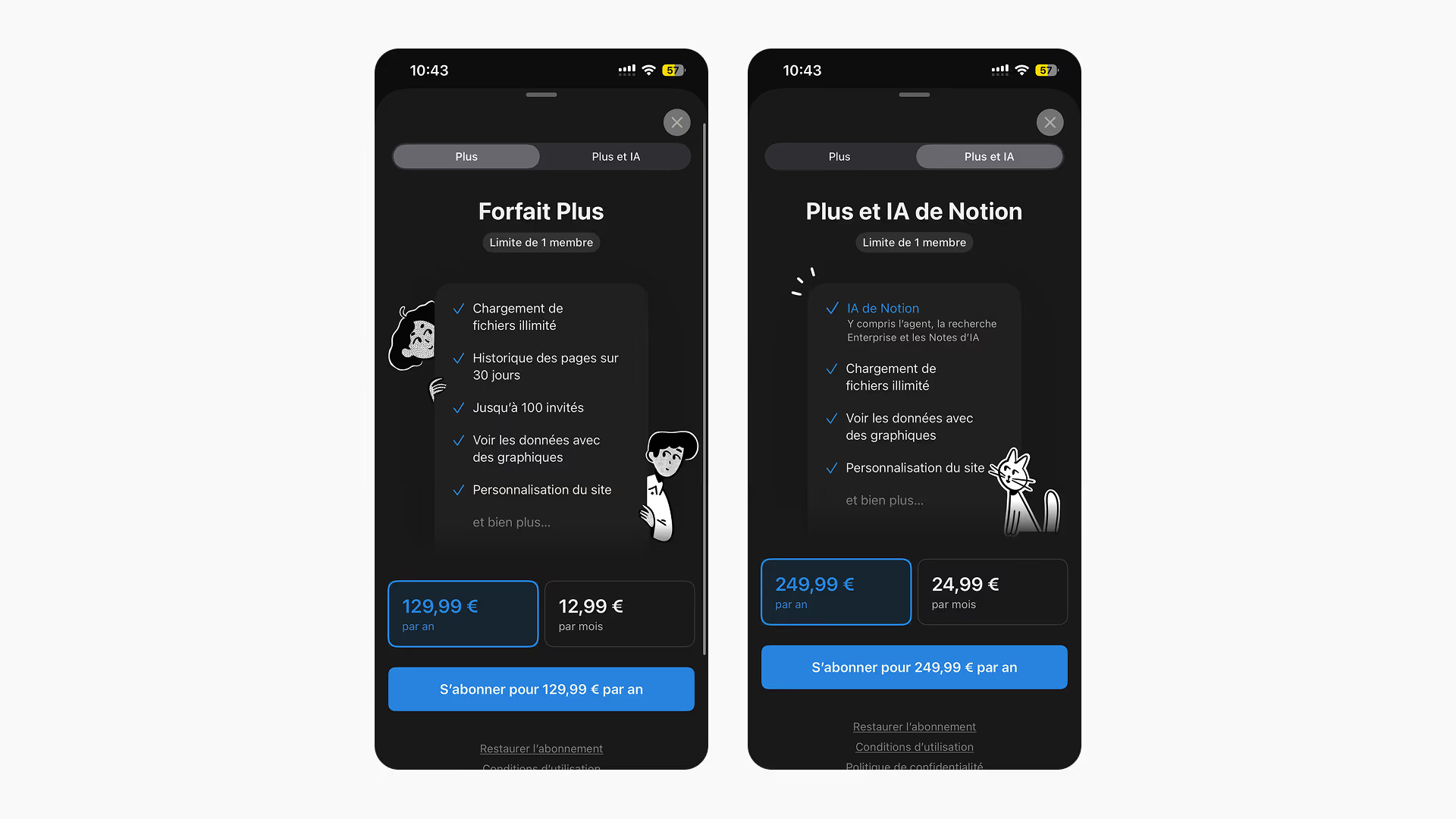
On Notion, the price does not arrive at first launch. It arrives when you pass a block limit, or when you want to add someone to the workspace.
The person already knows why they are looking at the offer. It is a hypothesis to test, not a screen to copy. The eleven openings are on the paywall examples.
Newsletter
Once a week.
Last issue
We opened 10 apps to see how they sell a subscription.
+534 people read us each week
2. Presenting features rather than benefits
"Unlimited access", "premium features", "personalized experience".
These phrasings are common, but they do not always say what the user will actually get.
A user does not buy a subscription to access a list of features. They buy a result, an experience, or the resolution of a problem.
The mistake: explaining what the subscription contains without showing what it brings.
What we would test: replace generic arguments with three precise benefits, tied to the motivation expressed during onboarding.
For a nutrition application, for example, "Access personalized recommendations" can be less concrete than "Get a meal plan adapted to your goal".
3. Giving the same weight to every subscription
Monthly, annual, weekly: some paywalls present every plan with exactly the same visual weight.
Yet the offers do not necessarily answer the same economic goals.
An application may want to favor the annual to improve initial cash collected and limit exposure to monthly cancellations.
The mistake: leaving the commercial hierarchy of the offer to chance.
What we would test: put the annual subscription forward, change the order of the plans, and compare the results with a neutral presentation.
Careful: increasing the annual share is not automatically a win. You also have to measure revenue per user and retention.
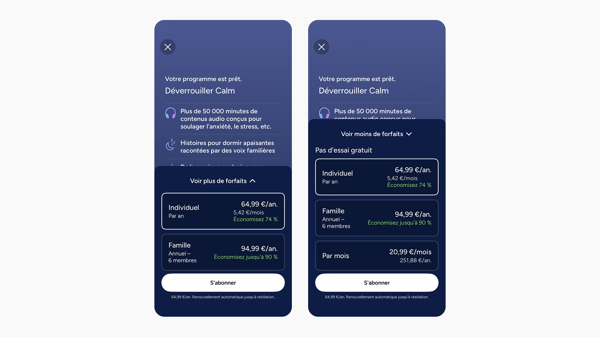
At Calm, the first screen shows two annuals: the individual at €64.99, written as €5.42 per month, and Family at €94.99. The monthly at €20.99 is behind "See more plans".
Three months at that price is almost the price of the year. The hierarchy is intentional. It does not, by itself, say that you should hide the monthly.
4. Showing a price without giving a point of comparison
An annual subscription at €59.99 can seem high when it is presented alone.
But its perception can change if the user understands that it represents about €5 per month, versus €9.99 for a monthly plan.
The price has not changed. Its context has.
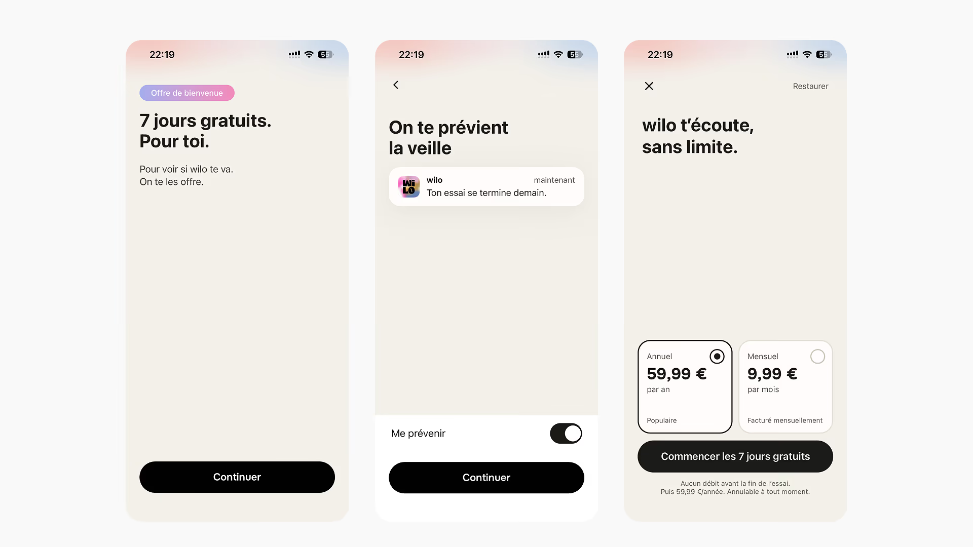
Wilo is a flow we built. Before the price, the screen says "7 days free. For you.", then shows the reminder the person will receive the day before.
The price arrives next: €59.99 per year, already checked, or €9.99 per month. The amount in the example above is the one on this screen.
The mistake: presenting prices without making them easy to compare.
What we would test: a variant showing the total annual price and its monthly equivalent, with a saving calculated transparently.
The amount actually billed, the payment frequency, and the trial conditions must stay clearly visible.
5. Offering a free trial without explaining how it works
"Try for free".
This promise can be attractive, but it can also raise questions.
How long does the trial last? When does billing start? What amount will be charged? How do you cancel?
The mistake: presenting the trial as a benefit without making its conditions understandable enough.
What we would test: an explicit presentation of the length, the price after the trial, and the cancellation terms.
A reassured user may be more willing to start their trial. The effect still has to be measured, without hiding the contractual information.
6. Copying a competing application's paywall
A paywall works for a well-known application. You take its design, its price, and its structure.
But your product does not necessarily have the same audience, the same perceived value, or the same reputation.
A paywall that performs on an American fitness application can be a poor fit for a French educational application.
The mistake: treating competitors' practices as proof of performance.
What we would test: use competitors to formulate hypotheses, then measure those hypotheses on your own audience.
A screenshot does not tell you the results of an A/B test.
7. Charging every user in the same way
Not all of your users have the same needs.
Some are looking for a one-off solution. Others want to use your application daily for several months.
Their willingness to pay can therefore be different.
The mistake: assuming an identical offer will be optimal for every profile.
What we would test: personalize the arguments or the presentation of the offers according to relevant information collected during onboarding.
It can be the user's goal, their experience level, or their intended use.
The experiment has to stay compatible with store rules and transparency obligations.
8. Piling information onto a single screen
A paywall containing ten benefits, three offers, several promotions, and many reassurance elements can become hard to understand.
Conversely, a screen that is too minimal can lack arguments.
The problem is not only the quantity of information, but its hierarchy.
The mistake: asking the user to process too much information before making a decision.
What we would test: a more concise version, organized around one main promise, a few benefits, and a clearly identifiable offer.
In some cases, a journey across several screens can also be relevant.
9. Neglecting social proof
Users can hesitate to pay for an application they are discovering.
Ratings, authentic testimonials, and credibility elements can help reduce that uncertainty.
The mistake: giving no element that lets someone evaluate the application's reliability.
What we would test: add verifiable social proof, relevant to the audience, and placed close to the purchase decision.
A real App Store rating or an authorized customer testimonial can be useful.
Inventing reviews or displaying unverifiable figures, on the other hand, risks degrading trust.
10. Measuring only the paywall conversion rate
You launch a new variant.
It converts 15% more visitors.
You conclude that the test is a winner.
But what happens if users choose the cheapest offer more often, or cancel faster?
The mistake: declaring a test a winner only because the conversion rate rises.
What we would measure:
- Paywall-to-Trial conversion.
- Trial-to-Paid conversion.
- The monthly and annual mix.
- Revenue per install.
- LTV over a comparable horizon.
- Retention and refunds.
A better conversion rate does not guarantee better revenue.
11. Launching several changes without being able to identify their impact
You change the price, the design, the trial length, and the paywall position at the same time.
The results improve.
But which change actually worked?
Impossible to determine precisely.
The mistake: multiplying changes without a clear experimental protocol.
What we would do: define a primary hypothesis, a success metric, and control metrics before each test.
It is possible to test several changes at once in a variant, but you then have to measure the effect of the whole, without attributing the result to an isolated element.
For applications with little traffic, prioritizing experiments is particularly important.
12. Optimizing the paywall when the problem comes from onboarding
This is probably one of the most expensive mistakes.
Imagine an application with 10,000 downloads, but only 3,000 users who reach the paywall.
Even an excellent paywall will not be able to convert the other 7,000 users as long as they are not exposed to it.
The mistake: working exclusively on the last screen of the funnel.
What we would do: analyze the full journey, from the first open through to the paid subscription.
Sometimes, reducing a friction in onboarding generates more revenue than changing the price or the color of the purchase button.
How should you prioritize your paywall optimizations?
At firstapp, we recommend not treating the 12 mistakes all at once.
We start by understanding where the main economic opportunity sits.
| Observed symptom | First lead to explore |
|---|---|
| Few users reach the paywall | Onboarding and positioning |
| Many see the paywall, few start a trial | Value proposition, offer, and pricing |
| Many start a trial, few become paying | Activation, value delivered, and cancellations |
| Good conversion, but low revenue per user | Subscription mix and pricing |
| Good acquisition, but weak retention | Product experience and recurring value |
These correspondences are diagnostic leads, not automatic conclusions.
Each hypothesis has to be confronted with the data.
Our approach: optimize revenue, not only clicks
A performing paywall is not measured only by the number of users who press "Continue".
It has to contribute to durably improving the revenue generated by users.
That is the approach we apply at firstapp, working on onboarding, offers, pricing, and monetization experiments.
On Mukiz, a mobile application mixing music and gaming, our support came with a rise in the iOS Download-to-Paid conversion rate from 1.55% to 3.05%, and an iOS LTV at 30 days multiplied by three, in under six months.
What we see in practice
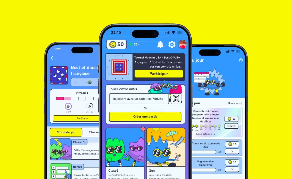
These results do not correspond to an isolated paywall test. They illustrate the value of analyzing monetization as a whole.
Conclusion: your paywall is not a simple payment screen
A paywall is an essential component of your monetization strategy.
But it never works independently of your onboarding, your product, or your pricing.
Before changing its design, start by understanding why users are not subscribing.
Identify the main frictions, formulate hypotheses, and measure the results on revenue, not only on clicks.
At firstapp, we help subscription applications generate more revenue with the users they already have.
Want to identify your application's monetization opportunities?
FAQ: optimizing a mobile application's paywall
What is a good paywall conversion rate?
There is no universal rate. It depends in particular on the category, the business model, and the definition used. You have to distinguish Paywall-to-Trial conversion, Paywall-to-Paid conversion, and overall Download-to-Paid conversion.
Should you offer a free trial on your paywall?
A free trial can lower the barrier to entry, but its effectiveness depends on the product's value and its length. You have to measure trials started, their paid conversion, and the revenue generated.
Is it better to put the annual subscription forward?
It can be relevant if the goal is to improve initial cash collected or the subscription mix. However, the best presentation depends on the audience and has to be validated by experiments.
How many A/B tests should you run on a paywall?
There is no ideal number. Testing capacity depends on traffic, conversion volume, and the effect you are trying to detect. It is better to prioritize a few solid hypotheses than to multiply underpowered tests.
Should you show the paywall before or after onboarding?
Both approaches can work. The best placement depends in particular on the moment the user understands the application's value. An A/B test can compare their effects on conversions and revenue.
Also read
What is a good conversion rate for my app in 2026?
What is a good conversion rate for a mobile app? See the 2026 benchmarks, how freemium and hard paywall differ, and the levers that grow your revenue.
5 underestimated paywall improvements that convert
Survivor bias pushes teams to copy paywalls that work elsewhere, without testing structural variables. Trial length, number of plans, price, and choice architecture weigh more than design.

My mobile app isn't converting: the complete diagnosis
An app that isn't converting often has a decent product and a blocked funnel. The block is in onboarding, the paywall, the trial, pricing, the store listing, or Android billing.