NewThe guide: 11 paywall examples

Paywall example11 paywall examples.

We analyzed 11 apps to see when they ask you to subscribe, which offer they put forward, and when they show you the price. For each app, we show what we noticed and what we would test from there.

Duolingo, Super Family at $0Duolingo, Family and IndividualSpotify, Individual PremiumCalm, three plansWilo, yearly and monthlyFlo, free trial onHeadspace, 14-day trialStrava, first month freeStrava, yearly price cut offHinge, a promise with no priceHingeX, 3 months at €69.99Canva, Pro and Pro+ with no amountNotion, Plus and AI
01

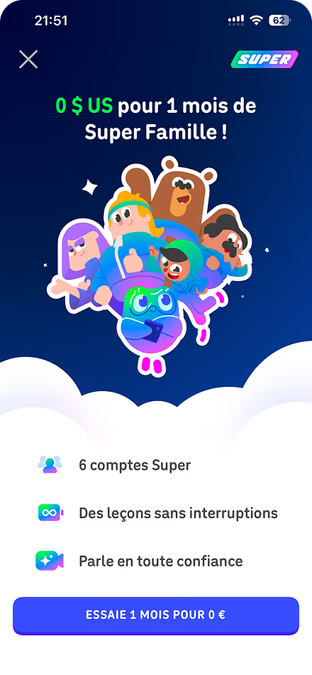
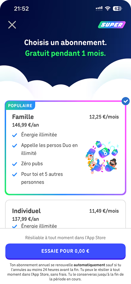
Duolingo. The price comes last.

You land on the first screen and Duolingo talks to you straight about Super Family. Six accounts, one free month. Then you choose whether you want a warning two or three days before the trial ends. They even tell you that you can cancel easily, at no charge.

When you get to the price, Family is already selected with the "Popular" badge. They show €12.25 a month for €146.99 a year. Just below, Individual is €137.99. For €9 more over the year, you go from one account to six. And you already knew that from the first screen.

A small detail that made me laugh: the title still says "0 $ US" while everything else is in euros.

02

Spotify. Four offers, four situations.

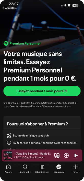
The detail I like at Spotify is that the music keeps playing when you open the Premium tab. You can look at the offers while you do exactly what you came for.

And the names do a good share of the work. You're a student, you look at Student. There are two of you, you look at Duo. Individual and Student get one month free, then go to €12.14 and €7.07 a month. On Duo and Family, at €17.80 and €21.24, the button just says "Get". By the time you reach the prices, you've probably already spotted the offer that fits you.

The music playing while you look at this is mine. You'll notice I have the taste of a true Tomorrowland nostalgic from the 2010s.

Ahhh Avicii, we miss you.

03

Calm. Two yearlies, the month is hidden.

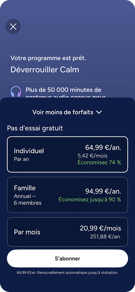
At Calm, I had to open "See more plans" to find the monthly. At first, I had a choice between two yearlies. Individual at €64.99, shown as €5.42 a month, and Family at €94.99.

Then you open the menu and you see the monthly at €20.99. Three months at that price is almost the price of the year. If you had gone looking for a cheaper way to start, you quickly see why Calm put the two yearlies on the first screen. Your program is already ready and the button says "Subscribe".

04

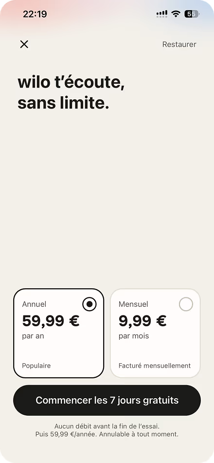
Wilo. The trial before the price.

Wilo is a flow we built ourselves. The first screen just says "7 days free. For you." with a small "Welcome offer" badge. Then we show you the reminder you'll get the day before, with the notification as it will appear on your phone. I wanted you to know what was going to happen before we asked you to pick a plan.

The price arrives on the last screen. €59.99 a year, already selected, or €9.99 a month. That's also where you can close the paywall or start your seven days. The first charge comes at the end of the trial if you keep it.

And when we want to bring it back out for Christmas or for a one-day offer, we change the hook. The three screens still do the same job.

05

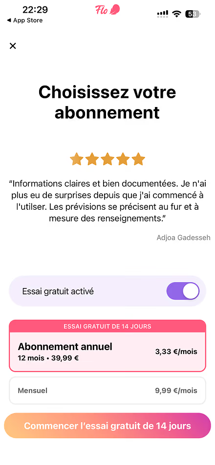
Flo. The trial already on.

On Flo, the switch already says "Free trial on" when you've just arrived. The 14 days are on the big yearly card and on the button. And when you look down, you see €3.33 a month on that card and €9.99 on the monthly.

That's what you compare first. The €39.99 you'll pay in one go for the year, you read after. If I had to take one thing from this screen on iOS, it would be the place they give the yearly and the way they show its price.

Since early 2026, Apple rejects in review a trial switch that is already on. This screen is on iOS. Either Flo has an exception, or nobody saw the problem.

06

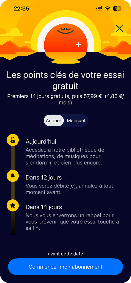
Headspace. Three dates, then the price.

The thing I like most at Headspace is that when you change plans, the dates change with them. You see when you have access, when you get the reminder, and when you'll be charged. They tell you again until when you can cancel, right above the button, exactly where you're asking the question.

The yearly is already selected. You get a 14-day trial, then €57.99 for the year, shown as €4.83 a month. If you switch to the monthly at €12.99, you drop back to 7 days. The benefits are the same, so you see right away what the plan choice changes for you.

07

New York Times. The month first.

The New York Times shows me a single offer right after account creation. €1.99 a month for twelve months, with €11.99 crossed out. I skip it, I land in the paper, and I still have a "Free for 30 days" banner while I read.

It's later that I find the yearly at €19.99 for the first year, then €100. If you do the math, twelve months at €1.99 comes to €23.88. The year costs less at the start. What I find interesting is the timing. When I find it, I've already started reading and I have a better sense of whether I want to come back.

08

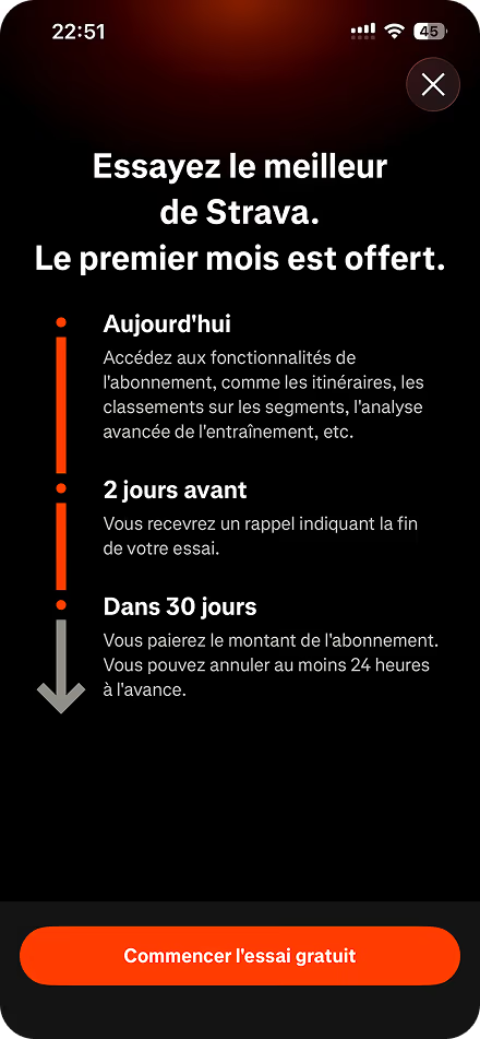
Strava. The price is cut off.

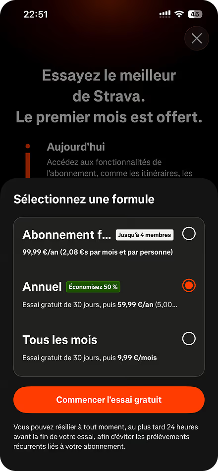
Strava tells you the first month is free, that you have access right away, and that you'll get a reminder two days before the charge. Up to there, it's clear.

Then you open the plan choice and the yearly, already selected, stops at "5.00…". It's supposed to say €5 a month, or €59.99 a year. Family is also cut off at "Subscription f…". And the only price that actually fits on the screen is the monthly at €9.99.

You spend a whole screen reassuring me and, the moment I want to compare, you cut off the number I came for. I'd fix that before touching the offer.

09

Hinge. Two screens, nothing free.

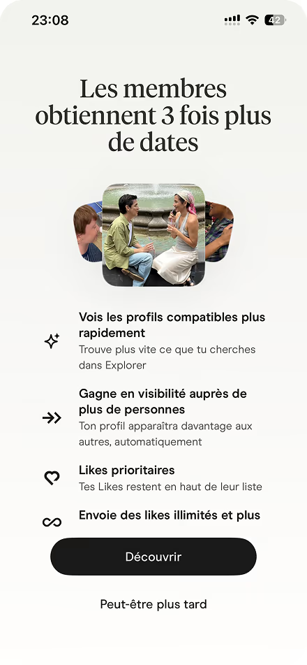
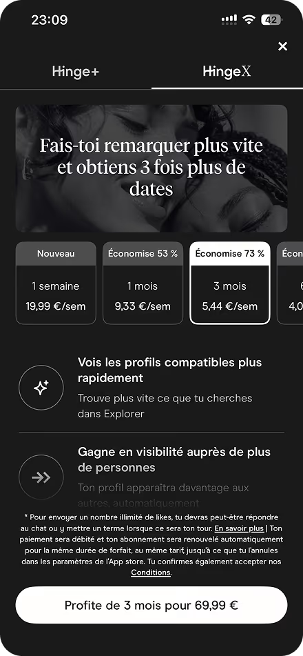
"Members get 3 times more dates." You read that, you tap "Discover", and you land on Hinge+ and HingeX. The detail I noticed is that "3 times more dates" comes back on HingeX, the more expensive one. Hinge+ mostly talks about likes. The first screen had already given you a reason to look at HingeX.

Three months are selected by default with "Save 73%". That's €44.99 on Hinge+ or €69.99 on HingeX. You can also take a week of HingeX at €19.99. I like that they stop at six months. If the app does its job, you hope you'll have stopped swiping before then anyway.

10

Canva. You choose without the price.

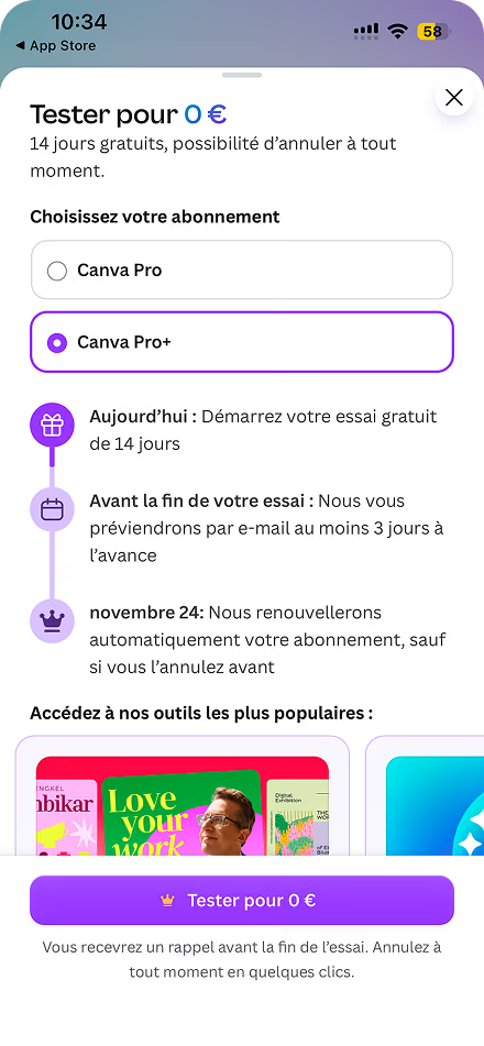
At Canva, you hit the offer at the moment you want to use a premium tool. I like that. You know exactly what you were trying to do when the paywall opened.

After that, I find the choice odd. You have Pro and Pro+, Pro+ is already selected, and the only price on the screen is "Try for €0" for 14 days. I tap and I find €17 a month or €169.99 a year for Pro+. And if I want to know what Pro costs, I have to go back, select it, and reopen the screen. At that point, what I want is to see the two prices side by side.

11

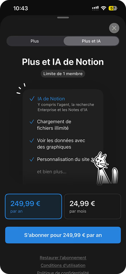
Notion. Two prices, and that's it.

Notion's paywall is almost boring to look at. Two tabs. Plus at €12.99 a month or €129.99 a year. Plus and AI at €24.99 or €249.99. Not even a small "Save X%", and twelve months of Plus comes to €155.88.

But look at when it arrives. You're in the middle of work and you hit a block limit. Or you want to add someone to your space and you land on an offer billed per person. At that moment, you already know why you're looking at the price. That's probably what I'd take from Notion before taking anything else from the screen.

The order

First the moment, then the offer,
then the design

At firstapp, we always start with two numbers. How many people see the paywall? And among those who see it, how many subscribe?

If few people reach the offer, we look at where they stop. Do they leave onboarding at a specific step? Do they reach the feature that triggers the paywall? That's what we use to choose the first test.

If the paywall is seen and few people subscribe, we change one thing at a time. Depending on what we see, we can revisit the free limit, test another price, or show the yearly a different way. Sometimes the test is just showing the price one screen earlier.

We rework the design after that. If the price is hard to read, we fix that right away.

Common questions

What is a paywall?

A paywall is the screen that asks you to pay to continue. In an app, it's the subscription offer. We analyzed eleven of them.

Where can I see a paywall example?

We analyzed eleven apps: Duolingo, Spotify, Calm, Wilo, Flo, Headspace, the New York Times, Strava, Hinge, Canva, and Notion. For each one, the screen, what it does, and what to take from it.

What's the difference between a hard paywall and a soft paywall?

A hard paywall asks you to pay before there is really a product. A soft paywall lets you use the app, then a limit brings the offer. Notion is soft: the price arrives when you go over the blocks, or when you add someone.

Should the price be on the first screen?

Not always. Duolingo and Wilo sell the offer first, and the price comes after. Canva has you choose Pro or Pro+ before showing the amount.

Can the free trial be left already on, on iOS?

Since early 2026, Apple rejects in review a trial switch that is already on. Flo's screen is on iOS anyway. Either Flo has an exception, or nobody saw the problem.

How do you raise paywall conversion?

Change one thing at a time. When the offer appears, a screen before the price, or how the year is written as a month. If almost nobody sees the offer, the subject is earlier, in onboarding or on the listing.

Where do you start when testing a paywall?

With one thing. When the offer appears, a screen before the price, or how the year is written as a month. Watch who starts, then who is still paying after.

If
is one of a kind,
write to us.

Newsletter

Once a week.

Last issue

We opened 10 apps to see how they sell a subscription.

+534 people read us each week