Mobile app onboarding: how to reach 20% conversion
77% of users abandon an app within the first 72 hours. Onboarding that converts shows the value before the email, the permissions, and the paywall.

Article summary
- 77% of users leave an app within the first 72 hours. The first session leaves 47 seconds to make the value felt.
- The order that converts: show the value, deliver a first success, cut the friction, then install an action that repeats.
- The aha moment is the action shared by users still active at day 30, done within the first 48 hours.
- Sign-up goes through Apple or Google. Each permission is requested at the moment it is useful, not at the entrance.
- A quick win in under 2 minutes and tooltips at the useful moment replace the tutorial nobody reads.
Summarize this article with
77% of users abandon an app within the first 72 hours. firstapp explains why this is not a product problem, it is an onboarding problem. And how to solve it.
Why onboarding is your absolute priority
Most founders optimize their ASO, their ad budget, their paywall. Almost nobody optimizes the first 3 minutes of the app. Yet that is where everything is decided.
You can have the best App Store listing in the world, the best ad targeting, the best product. If the user does not understand your app's value in the first minutes, they leave. And they do not come back.
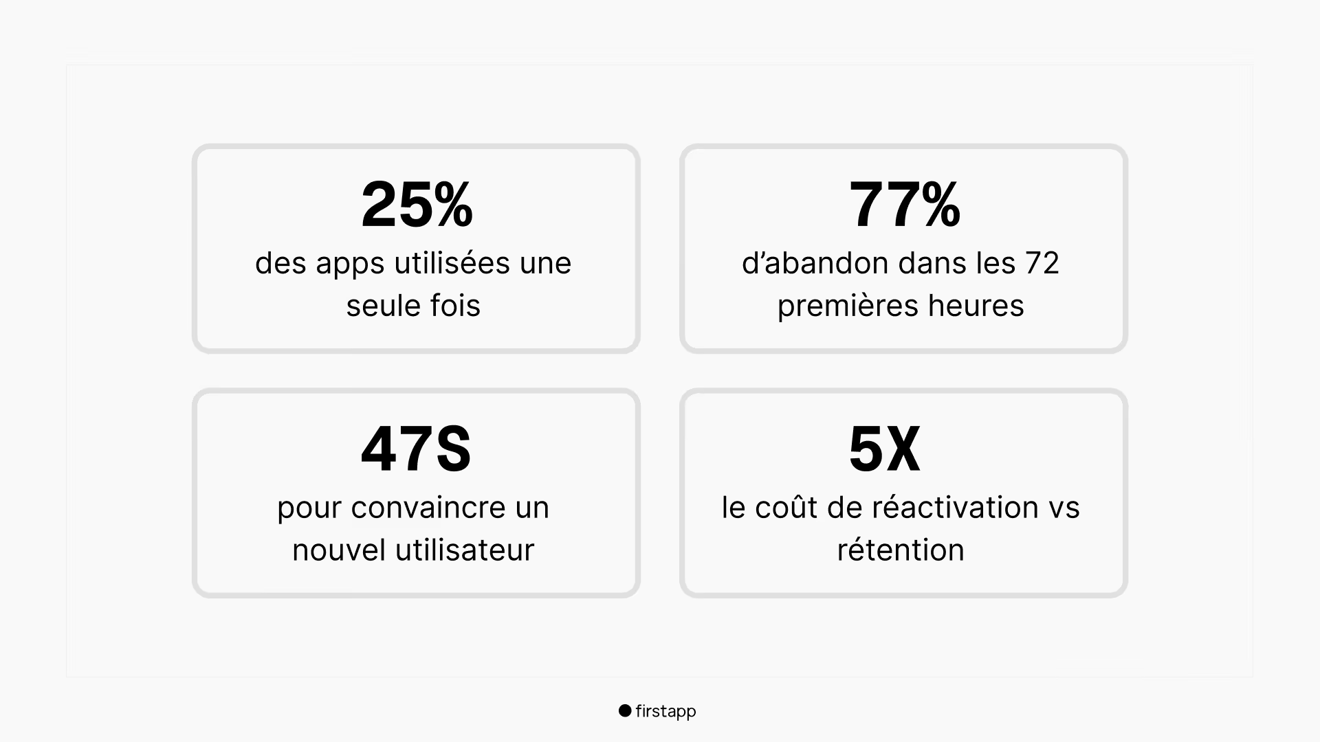
What these numbers say in concrete terms: every euro spent on acquisition is partly wasted if onboarding does not follow. Fixing onboarding makes your ad budget twice as profitable without touching it.
Newsletter
Once a week.
Last issue
We opened 10 apps to see how they sell a subscription.
+534 people read us each week
What you really have 47 seconds to do
47 seconds. That is the average window before a user decides to stay or leave during their first session. It is not time to explain your app. It is time to make them feel its value.
Onboarding that converts fulfills 4 objectives, in this order:
1. Show the value before asking for anything
The user does not yet know why they should trust you. Do not ask for their email, their permissions, or their subscription before they have experienced something concrete in the app.
2. Get the user to their first success as fast as possible
The "aha moment" is the moment the user instinctively understands why the app exists and why they need it. Your only objective is to get there as fast as possible.
3. Cut friction to its minimum.
Every extra step costs users. Every form field, every permission asked too early, every superfluous explanation screen is a leak in your funnel.
4. Create a habit from day one
A user who completes a first meaningful action in the app is much more likely to come back. Onboarding does not stop at sign-up. It stops at the first repeated behavior.
The 3 types of onboarding: which one to choose?
There is no single good onboarding. The choice depends on your app's complexity and your users' profile.
A.Benefit-led
A few screens that explain what the app does: fast, light, ideal for simple apps whose value is obvious. The risk: too generic, and the user skips without retaining anything.
B. Personalization-led
A short questionnaire to adapt the experience to the user from the start. Very effective for health, fitness, and learning apps. A double effect: data collection AND an immediate feeling that the app "knows you".
C. Action-led
The user learns by doing, not by reading. They are guided directly inside the app, with contextual tooltips and progressive mini-wins. The most effective for retention, and the most complex to implement.
For most apps, the winning combination is: 2-3 benefit screens → a short personalization questionnaire (3-4 questions max) → a first guided action in the app. Not all three in full, the essential part of each.
The aha moment: how to find it and speed it up
The aha moment is the precise instant when the user understands, emotionally rather than intellectually, why your app is going to change something for them. It is not a feature. It is a feeling.
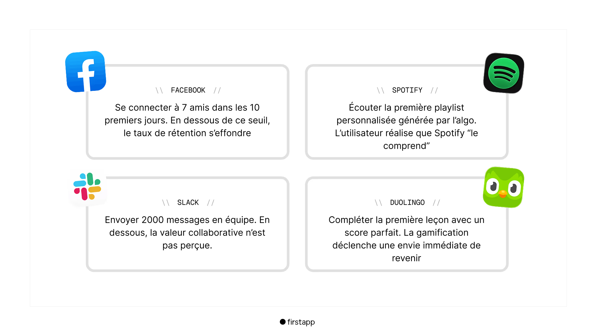
To find your aha moment, one reliable method: analyze the behavior of users who stay versus those who leave. What action did users still active at day 30 all take within the first 48 hours? That is your aha moment.
Once it is identified, here is how to shorten the time to reach it:
1. Remove everything that is not on the direct path. Every screen, every step that does not lead the user toward the aha moment should be postponed or deleted.
2. Pre-fill with sample data. An empty app is hard to understand. Show what the experience looks like with content already there: the user projects themselves and understands instantly.
3. Guide actively, not passively. Do not leave the user guessing where to go. Arrows, highlights, contextual messages: show exactly which action to take next.
4. Celebrate the first success excessively. Animation, sound, a congratulations message. The first win has to be felt. That is what creates the desire to come back.
5. Remove choice. The paradox of choice is your enemy. Guide the user toward one precise action at a time.
Cutting friction: the 6 types to eliminate
Friction is everything that slows, complicates, or discourages the user along the way. Cutting it is one of the most profitable actions you can take, often without touching the product.
1. Sign-up friction
Asking for an email, a password, a verification at the entrance. Solution: offer sign-in with Apple or Google as the main option. Manual sign-up becomes the secondary choice.
2. Permission friction
Asking for notifications, location, or the camera too early, before the user understands why they would need them. Solution: ask for each permission at the precise moment it becomes useful, explaining the concrete benefit.
3. Cognitive friction
Too much information at once, long text, busy interfaces, too many choices. Solution: one piece of information per screen, one choice at a time.
4. Time friction
Too many steps before reaching the value. Solution: audit every onboarding step and ask: is this step really necessary right now?
5. Paywall friction
Showing the paywall before the user has experienced the value. Solution: let the user reach their aha moment before you present a subscription offer. They will be far more receptive.
6. Comprehension friction
Onboarding that explains how to use the app instead of letting them live the app. Solution: replace tutorials that are read with tutorials that are lived. The user learns by doing.
The 5 onboarding patterns that convert
Pattern 1 - Value first
The user sees or lives the app's value before they even sign up. Airbnb, for example, lets visitors browse listings without an account. Desire is created before the ask. Apply this principle: which part of your app can be shown or lived without sign-up?
Pattern 2 - The personalization questionnaire
3 to 5 simple questions at the start of onboarding to adapt the experience. Duolingo asks your language, your level, your goal. Result: the user feels the app was made for them from the first minute. This pattern significantly raises the activation rate.
Warning: the questionnaire must serve to personalize the experience, not to collect marketing data. If the user does not see the impact of their answers on the app, they experience the exercise as a waste of time.
Pattern 3 - Progressive disclosure
Do not show every feature at once. Introduce features progressively, as the user needs them. Notion hides the tool's complexity from new users. They discover advanced features when they are ready to use them.
Pattern 4 - The quick win
Design a mini-win the user can complete in under 2 minutes. That first success triggers dopamine and creates the desire to continue. The faster and more visible the win, the stronger the effect.
Pattern 5 - Contextual tooltips
Rather than a tutorial at the start of the app that nobody reads, help bubbles that appear at the right moment, on the right feature, when the user actually needs them. Less intrusive, more effective, and the user keeps a sense of control.
The 5 classic onboarding mistakes
Mistake 1 - Explaining instead of letting them live it
Onboarding slides that describe features do not create engagement. Fix: replace each explanatory screen with a concrete action in the app.
Mistake 2 - Asking too early
Permissions, email, subscription before the value. The user has no reason to say yes. Fix: the golden rule, ask only after you have given.
Mistake 3 - Onboarding that is too long
More than 5 steps before the first action in the app is too many. Each extra step lowers the completion rate. Fix: audit and ruthlessly cut anything that can wait.
Mistake 4 - Not measuring
Without data on where users drop off, it is impossible to know what to fix. Fix: install an analytics tool (Mixpanel, Amplitude) and track every onboarding step from launch.
Mistake 5 - Treating onboarding as finished
Onboarding is not a page you write once. It is a funnel you optimize continuously. Fix: plan an onboarding audit at every major update.
Real case: Sticker Editor
Everything just described, we applied it for Sticker Editor, a sticker-creation app. The old onboarding presented the app. The new onboarding lets people live the app.
One structural change: build creation of the first sticker directly into the onboarding flow, before the user has even seen the paywall. The idea is simple: let them live their aha moment, their first win, before you ask for anything.
The review request was repositioned too: triggered after that first successful export, not before. The user has just lived their aha moment. They are in the most favorable emotional state to leave a positive review.
Onboarding and the review strategy are linked. Good onboarding creates the right moment to ask for a review. A good review strengthens the credibility of the App Store listing. The loop is complete.
Your app already exists but onboarding does not convert enough? We can audit it and rework it from A to Z - onboarding, paywall, ASO - through our subscription, with no commitment. That is exactly what we did for Sticker Editor.
Frequently asked questions about mobile onboarding
What is the onboarding process of a mobile app?
The onboarding process of a mobile app is the sequence of screens and actions that guides a new user from their first launch to their first experience of value. Good mobile onboarding runs in three phases: the discovery phase (presenting the app's main value in 2 to 3 screens maximum), the personalization phase (collecting the information needed to adapt the experience: goals, preferences, profile), and the activation phase (bringing the user to their aha moment, meaning the first concrete result that makes them want to stay). The goal is to reach that first result in under 3 minutes. Beyond that, the risk of abandonment spikes.
What are the steps to create a mobile app?
Creating a mobile app follows 6 key steps. First, validation: talk to real potential users to confirm the problem is real and that people would pay to solve it. Next, scoping: define the MVP perimeter with the MoSCoW method so you keep only what is essential. Then UX/UI design: wireframes, mockups, and definition of the onboarding and the main user journey. Development follows, in React Native for a cross-platform iOS and Android project. Then the test phase: TestFlight for beta tests with real users before the public launch. Finally, launch and continuous optimization: App Store submission, ASO, review strategy, and iterations based on user data.
What is an effective mobile app launch strategy?
An effective mobile app launch strategy rests on 4 pillars. First, prepare distribution before launch: build an audience on social networks, contact early adopters manually, and prepare a Product Hunt launch. Second, optimize the App Store listing before launch day: screenshots that convert, a title with the main keyword, well-chosen keywords. Third, include the paywall from v1: an app with no revenue model at launch does not validate its business model. Fourth, set up a review strategy from the first days: the first reviews set the initial rating, which directly affects organic downloads. Launch is not an end. It is the start of a continuous optimization cycle.
Also read

Aha moment: how to find it in your onboarding?
More than 70% of users uninstall in the first 3 days, often without having felt the app's value. The aha moment is that click, and onboarding has to place it before the paywall.
Mobile app onboarding: Duolingo, Calm, and Headspace, decoded
60% of a mobile app's conversions happen in the first week, and 55% of cancellations of a 3-day trial happen on Day 0. Duolingo anchors motivation, Calm makes you feel the product, Headspace personalizes the path.
How do you promote a mobile app?
To promote a mobile app, the most effective channels in 2026 are ASO (App Store Optimization) for free, lasting organic traffic, TikTok and Reels to generate awareness and organic installs through authentic content, building in public on LinkedIn to reach an audience of founders and qualified early adopters, and Product Hunt for a download spike at launch. Paid advertising (Apple Search Ads, Meta Ads) comes in as a complement once the conversion funnel is validated, not before. Spending on ads with unoptimized onboarding or an unoptimized paywall amplifies the leaks rather than the growth.