How to optimize a mobile app paywall: architectures, copy, and tests
82% of trial starts happen on the day of installation. The paywall is shown after the aha moment, a second screen recovers refusals, and six architectures plus a 14-day test plan structure the system.

Article summary
- 82% of trial starts happen on the day of installation. The paywall arrives after the aha moment.
- Six architectures depending on the app: trial first, value first, credits, three tiers, lifetime anchor, entry offer.
- On refusal, a second screen offers another option: a week, a limited discount, or a cheaper feature.
- The 100-point audit targets 75 before the details. Below 50, timing and clarity come before the copy.
- Paywalls.Design tests measure 12 to 18% more conversions with a light button animation. The D14 decision looks at conversion and retention together.
Summarize this article with
At firstapp, we do not "design" a paywall. We build a monetization system. The difference between a paywall that decorates and a paywall that prints money is a method, not a template. Here is the complete method, with a paywall example open beside it.
The firstapp framework, the base formula
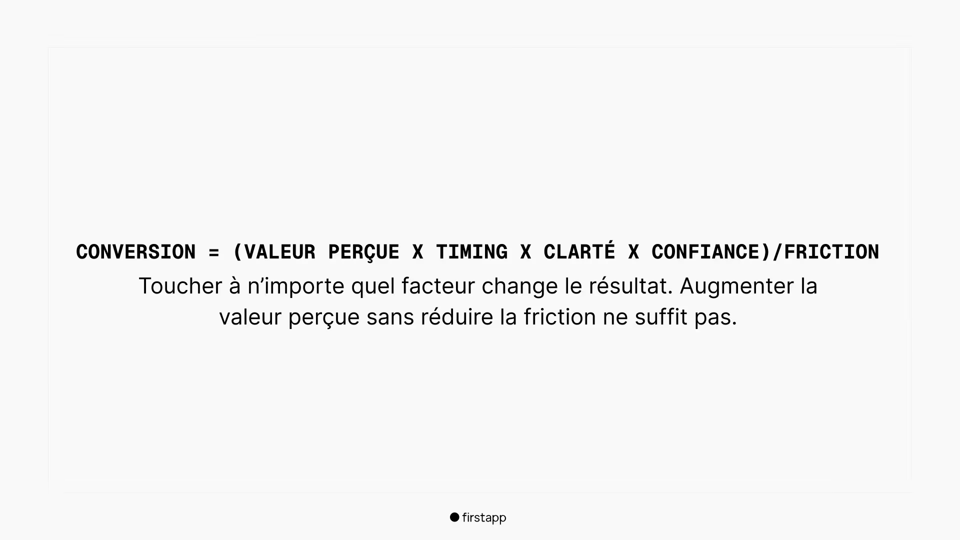
Before talking about design, copy, or timing, there is one truth to absorb: a paywall is a system, not a screen. And like any system, it follows a formula.
What each factor means in practice:
Perceived value - "What do I get, right now?" The user must understand the concrete benefit before seeing the price. Not the features, the result.
Timing - "Why am I being offered this here, now?" A paywall shown at the wrong moment is a paywall ignored, whatever its design.
Clarity - "I understand the price and what I am buying." The slightest blur on the terms creates distrust. Distrust kills conversion.
Trust - Reviews, guarantees, proof, transparency. The user must feel safe enough to take out a card.
÷
Friction - Useless scrolling, too many options, jargon, surprises. Every obstacle between the user and the payment button costs conversion.
To go further on timing:Why your users cancel their trial within 24h
Newsletter
Once a week.
Last issue
We opened 10 apps to see how they sell a subscription.
+534 people read us each week
The express audit, score your current paywall
Before optimizing anything, measure where you stand. Here is the firstapp score out of 100, copy-paste it and score your current paywall honestly.
A) Clarity - /20
I understand in 3 seconds what I get - /5
Plans and prices are readable without effort - /5
The terms (trial, renewal) are transparent - /5
The CTA says exactly the action - /5
B) Value - /25
A result-oriented promise - /10
3 concrete, specific benefits - /10
The paywall talks about "me" (the user), not about "us" - /5
C) Trust - /25
Proof (reviews, numbers, press) - /10
Reassurance (easy cancel, restore, support) - /10
No dark pattern - /5
D) Timing & friction - /30
Paywall shown after a moment of value - /10
No useless step - /10
A logical "Continue for free" option - /5
Cooldown / anti-spam in place - /5
firstapp target: aim for 75/100 before optimizing the details. Below 50, work on the fundamentals first, timing and clarity, before you touch the copy or the design.
The 6 paywall architectures
There is not one good paywall. There are 6 architectures, each suited to a type of app and a type of user. Choosing the wrong architecture means optimizing the wrong thing.
1. Trial-first, the most universal
When: a subscription "tool" app + regular use
The promise is simple: "Try now, pay later." This is the default architecture for utility, productivity, fitness, and education apps. The free trial reduces initial friction and lets the user build conviction before paying.
Result-oriented title → 3 benefits → Annual price (highlight) + monthly (secondary) → CTA "Start the trial" → Terms + reassurance
2. Value-first, demonstration before payment
When: AI, generation, "wow" apps
The promise: "See what you are going to get, then unlock." The user sees the result before seeing the price. Ideal for apps whose value is immediately spectacular and visible - photo editing, content generation, AI apps.
Result preview (before/after) → 3 benefits → Offer + price → CTA
3. Credits / Packs, built for AI
When: variable cost (images, tokens, generation)
The promise: "You pay for capacity." When your app has infrastructure costs that vary by action (API calls, generation), the credit model is often more honest and better received than a fixed monthly subscription. The user understands exactly what they are buying.
What 1 credit unlocks (crystal clear) → Packs (Small / Medium / Large) → Subscription as an option (for power users)
4. Tiered, Basic / Pro / Ultra
When: several distinct usage profiles
The promise: "Choose the level that fits your need." It works when you really have different user segments with distinct needs. Absolute rule: 3 tiers maximum. Always highlight "Pro" visually. Beyond 3 options, the paradox of choice kills conversion.
Basic (to get started) → Pro (highlighted + "recommended" badge) → Ultra (for power users)
5. Lifetime anchor
When: strong trust, a utility app, an anti-subscription audience
The promise: "Buy once, enjoy forever." The lifetime offer plays the role of a psychological anchor, it makes the annual subscription attractive by comparison. Rule: lifetime is an option or an anchor, rarely the main offer.
Annual (highlighted) → Monthly (option) → Lifetime (anchor / option)
6. Starter offer, a small entry price
When: cold acquisition from TikTok / ads, a need to convert quickly
The promise: "Start for almost nothing, upgrade later." Perfect for cold traffic from ads, the user has not built conviction yet. A low-priced week, a first month on promo, or a "starter" pack radically reduce initial friction.
Small entry offer (week / promo month) → Clear CTA → Upgrade presented later
When to show the paywall
The best paywall in the world does not convert if it appears at the wrong moment. Timing is the most impactful lever, and the most underestimated. Here are the 10 triggers that work.
Trigger 1
After the aha moment - the first real result obtained
Trigger 2
Before export / save / share
Trigger 3
After the 2nd use - engagement proven
Trigger 4
After personalization - the user has invested
Trigger 5
At a natural block - limit reached
Trigger 6
When the user comes back - session 2 or 3
Trigger 7
After positive feedback - "Do you like the app?"
Trigger 8
When they compare / explore - strong intent
Trigger 9
After a success - goal reached
Trigger 10
When they ask for more - an advanced feature
Client case of Calyra (formerly Nutria), the app uses a long, carefully built onboarding to bring the user to understand their nutritional situation, identify their goals, and perceive the app's value, before showing any payment screen. When the paywall appears, the user is already convinced. They are not discovering the product, they are choosing to access it.
The anti-spam rules
An aggressive paywall generates churn, not conversion. These rules are non-negotiable:
✓ Cooldown: no more than 1 paywall every 24h per user.
✓ Never on the first screen without value, except a very soft starter offer with an ultra-clear promise.
✓ If the user closes it 2 times: wait 72h or a new strong trigger before showing it again.
✓ Always keep a clear "continue" path - blocking the user completely creates churn, not conversion.
The offer and the pricing
The offer ladder recommended by firstapp
1. Annual: highlighted, best deal, the main push.
2. Monthly: a secondary option for people who resist an annual commitment.
3. Lifetime: an option or an anchor, not the main offer except in a very specific case.
4. Winback: an automatic win-back offer after churn. Often the most profitable conversion.
5. Contextual promo: triggered after 2 refusals + a strong moment of value. Not a pressure tool, a timing tool.
The quick decision rules
→ Daily or weekly use → subscription with an annual push
→ Occasional use → lifetime or credits
→ An AI app with inference costs → credits + a subscription for heavy users
Non-negotiable transparency: "Automatic renewal, cancel anytime", "Restore purchases", "Trial: X free days, then €Y/period". These elements are not optional, Apple checks them and users expect them.
The 3 pricing principles that convert
1. Always offer at least two options. A single option does not force the user to compare, it only asks them to say yes or no. Two options create a choice context that increases engagement with the paywall. The recommended option must be visually highlighted.
2. Highlight the savings of the annual offer. Show the monthly equivalent of the annual offer next to the standard monthly price. "€2.99/month" vs "€9.99/month - save 70%" triggers loss aversion: the user does not want to pay more for the same thing.
3. Test showing the weekly price. For apps with a monthly or annual subscription, showing the price brought down to the week ("less than €1 per week") makes the amount psychologically more accessible. It is a documented technique that works across many app categories.
The free trial: length and placement
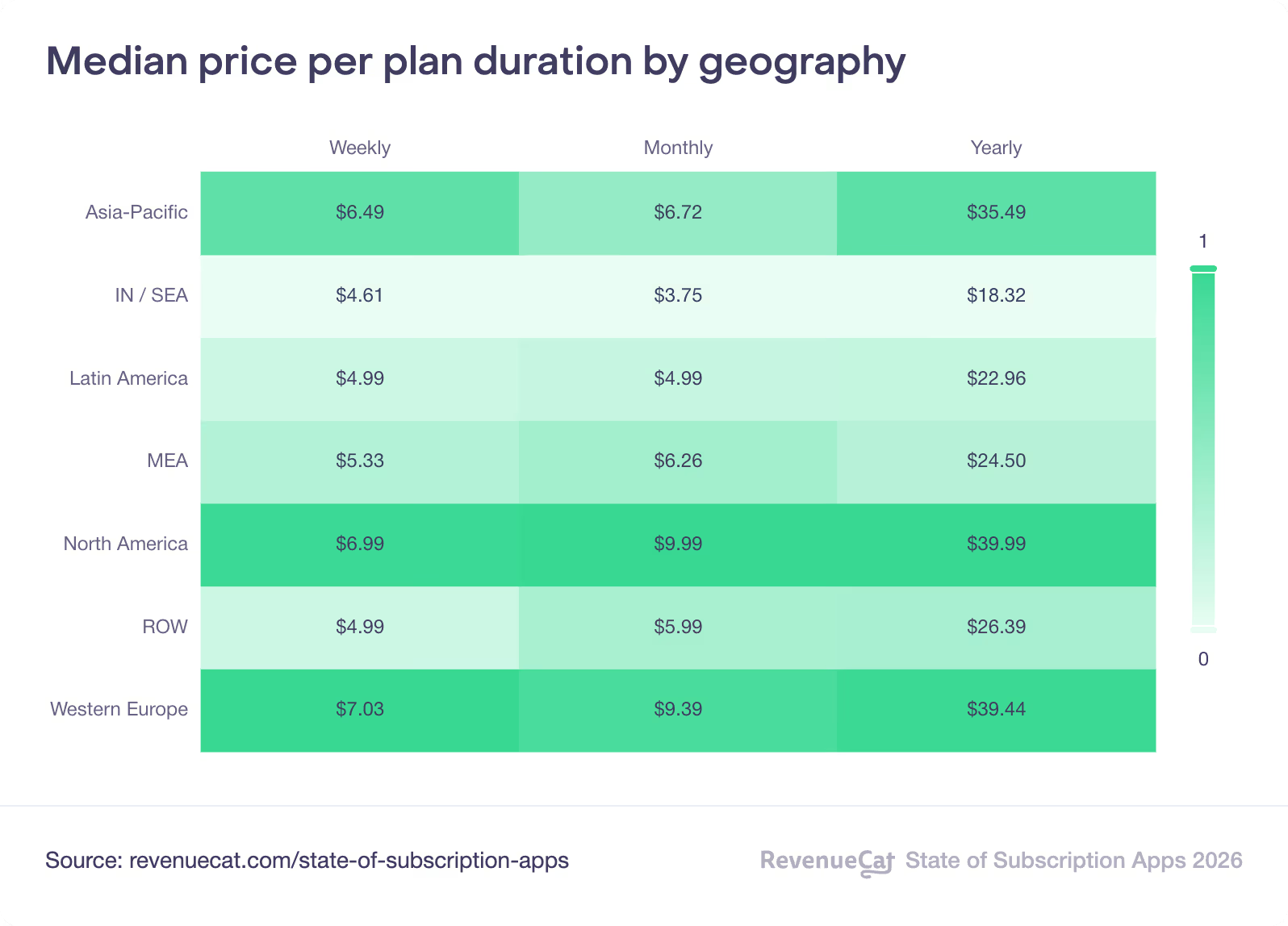
The free trial is one of the most powerful tools for reducing friction at the door, but used badly, it creates churn without value. The length and placement of the trial must be calibrated to the time the user needs to understand your app's value.
Choose the right length
| Length | For whom | Why it works |
|---|---|---|
| 3 days | Creative apps, utilities, tools | The value is immediate. A short trial creates urgency. |
| 7 days | Most apps - the RevenueCat benchmark | Long enough to build a habit, short enough to keep the urgency. |
| 14 days+ | Habit apps - fitness, education, health | The user needs time to see results and anchor a routine. |
The reverse trial: a trend rising in 2026. Instead of starting with a limited free version, you give the user full access for the length of the trial, then you downgrade them to the free version at the end. Apps such as Strava and Ladder have documented better conversions with this model because the user loses something they had, rather than never having had access to premium.
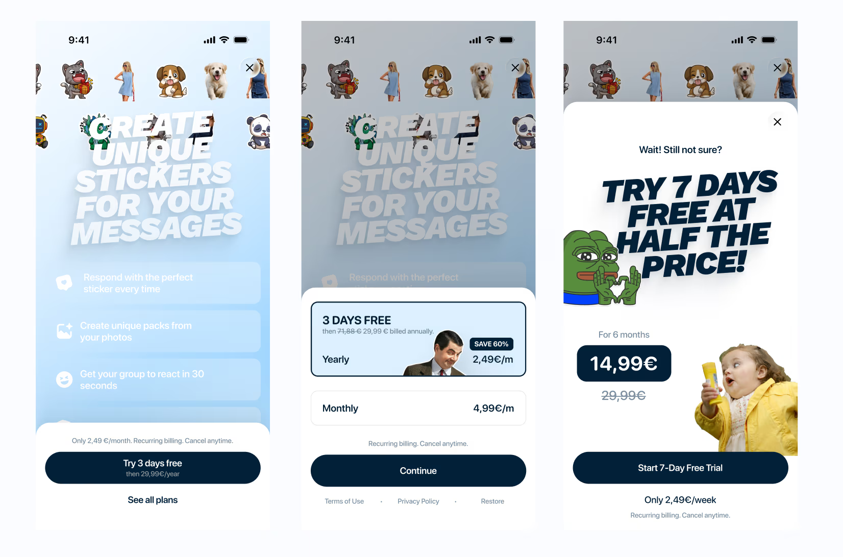
The double paywall: recovering refusals
This is the most underused lever, and one of the most profitable. When a user closes your paywall without subscribing, most apps let them leave. A well-optimized app immediately offers them an alternative.
The double paywall is a second payment screen that appears automatically when the user tries to refuse the first offer. The offer is different, shorter, cheaper, or from a different angle. The goal: turn part of the refusals into subscribers, without forcing it.
How to structure the double paywall
1. First offer: your main offer, annual or monthly, with the free trial if you offer one. This is the offer you want to maximize.
2. On refusal: automatically trigger a second screen with a fallback offer. Three classic options: a weekly offer (more accessible psychologically), a time-limited discount on the main offer, or access to a specific feature at a lower cost.
3. Tone of the second paywall: not aggressive. A short message that acknowledges the refusal and offers something different, "Not ready yet? Try X for €Y/week" works better than an aggressive repeat of the same offer.
Client case of Sticker Editor - The paywall was redesigned from A to Z: structure, visual hierarchy, and copy. The conversion lever was adding an automatic second paywall when the user tried to refuse the first offer. Rather than losing the user, a lower-priced offer appeared. A significant share of the refusals turned into subscriptions.
The double paywall must stay honest. Apple watches for dark patterns, a second screen that misleads or manipulates will be rejected. The goal is to offer an alternative, not to trap the user. Transparency on the price and the terms stays mandatory on both screens.
The copywriting kit, ready to paste
Paywall copy follows a simple rule: clarity before creativity. The user who lands on your paywall is not there to be impressed, they are there to decide. Here are the elements ready to use.
Result-oriented headlines
Pick one, adapt the brackets to your app
→ Unlock results in 1 minute.
→Move up to pro level, without effort.
→Transform your [goal] starting today.
→Get a clear result, faster.
→Stop guessing. Do it right.
Benefits, the format that works
Result + feature, never the feature alone
→ Save [time] per session thanks to [feature].
→ Get a [result] that is more [quality].
→ Unlock [key feature] + unlimited export.
CTAs that convert
Benefit-led, never a generic action
→Start the free trial
→ Unlock now
→ Go Premium
→ Continue with Pro
→ Get my result
✓ Use the first person: "Start my trial" rather than "Start your trial", it creates psychological ownership.
Objection killers, micro-copy under the CTA
These lines reduce payment anxiety
→ No commitment, cancel whenever you want.
→ You can restore your purchase at any time.
→ Free trial: no payment today.
→ Secure payment via the App Store / Google Play.
Proof / Trust lines
⚠️ Warning : Social proof reduces perceived risk
→ Already used by [X] people.
→ Average rating [X]/5 on the stores.
→ Fast support: reply within [X]h.
→ Cancellation in 2 taps. No questions.
The paywall design modules
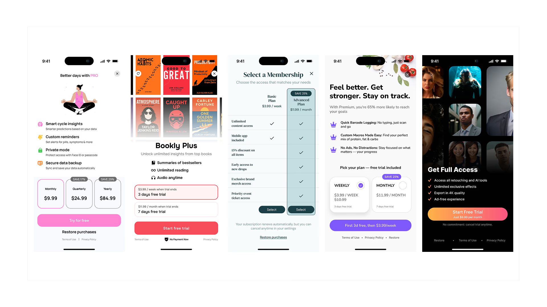
A paywall is built like Lego, modules stacked in the right order. Here are the essential modules and the optional modules depending on your app.
Essential modules
1. Hero - title + a short proof. The first thing seen must answer "why would I pay?"
2. Bullets - 3 benefits maximum. Beyond that, you dilute attention.
3. Pricing block - annual highlighted, monthly secondary. The price must never surprise.
4. Single CTA - a single primary button, with a light animation to catch attention. Tests run by Paywalls.Design across hundreds of apps show that adding animation to the CTA button increases conversions by 12 to 18% compared with static designs.
5. Trust row - cancellation / restore / secure payment. In small type under the CTA.
6. Terms - readable, not hidden. Apple checks them, and users do too.
Optional modules
+ User reviews (1-2 maximum) + App Store rating
+ Before/after preview (especially for creative or AI apps)
+ Free vs Premium comparison, 5 lines maximum, not an exhaustive table
+ "Recommended plan" badge on the annual offer
The UI rules
✓ 1 screen = 1 message. Do not overload it.
✓ Maximum 2 plans visible, otherwise cognitive overload.
✓ Strong contrast on the CTA, it must jump out.
✓ Avoid jargon ("premium features", "AI engine"...) talk about the result.
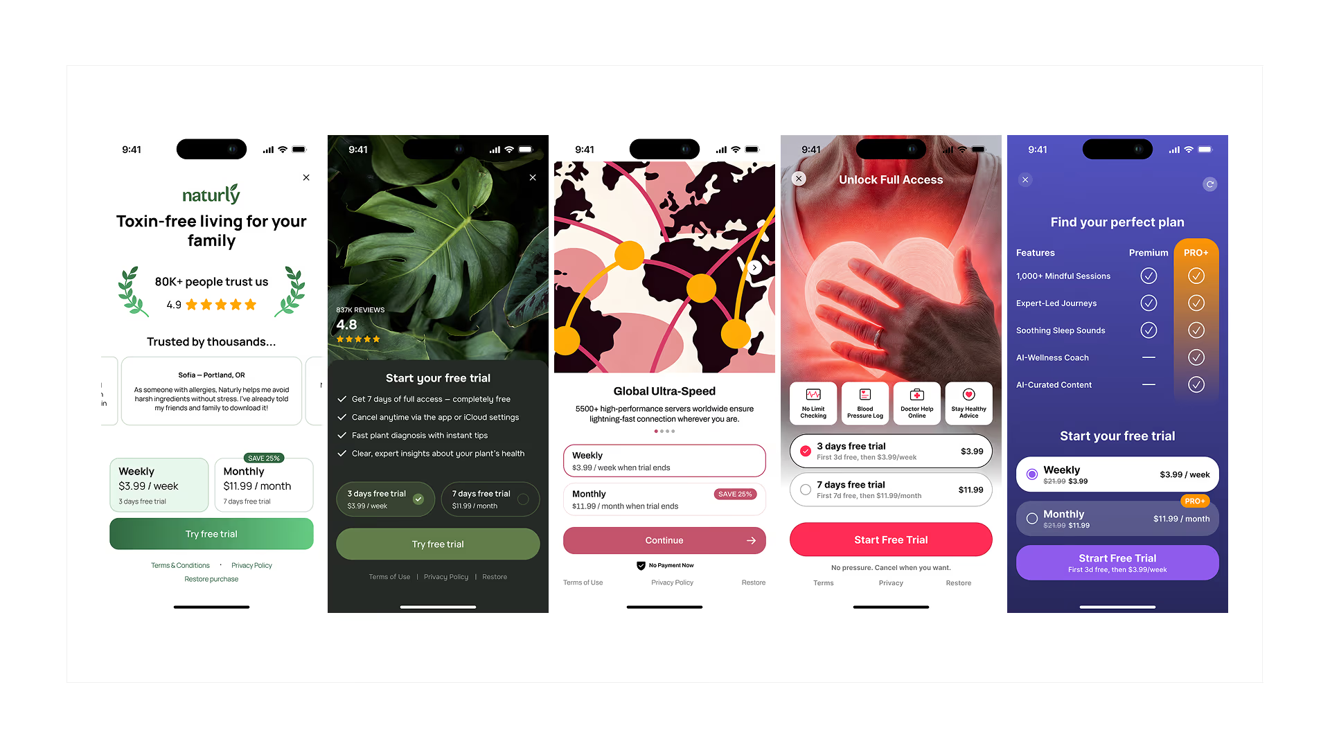
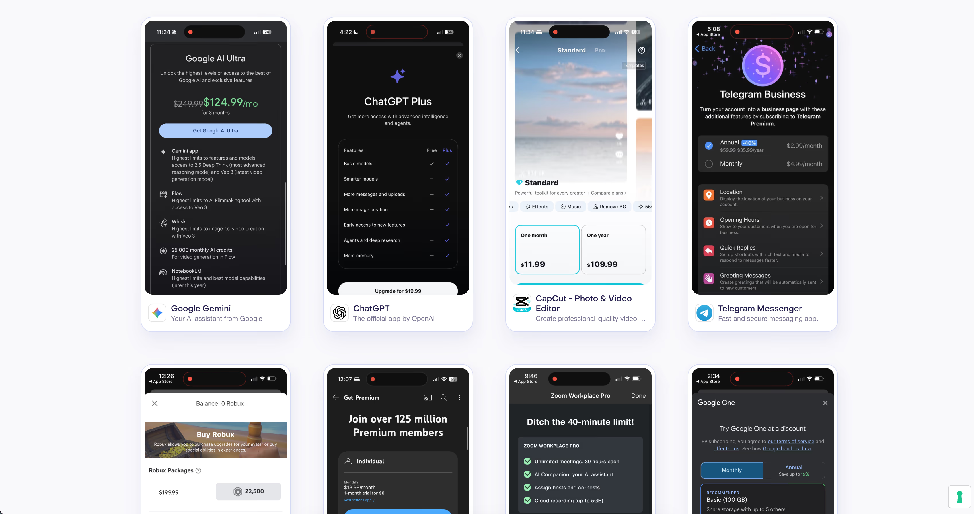
For inspiration from the best paywalls on the market before you design yours: paywalls.com (RevenueCat), paywallscreens.com (Superwall), adapty.io/paywall-library (Adapty) and purchasely.com/paywall-gallery (Purchasely). Filter by app category and take 30 minutes to see what the best apps in your niche do.
The 14-day A/B test plan
An untested paywall is a paywall optimized by chance. The golden rule: test 1 big lever at a time, not 10 micro-changes at once. One clean test is worth infinitely more than 10 messy tests.
The 5 levers to test first
1. Timing, paywall after the aha moment vs cold. This is often the most impactful test.
2. The offer, annual highlight vs monthly highlight. Testing what is highlighted changes everything.
3. The message, "result" copy vs "features" copy. The result wins almost every time.
4. The structure, trial-first vs value-first. It depends on the type of app.
5. Trust, adding reviews and proof. Often underestimated.
The 10 high-impact tests to run
→ Paywall after the Aha Moment vs cold
→ Annual highlight vs monthly highlight
→ Trial-first vs value-first
→ 3 bullets vs 6 bullets
→ Adding proof (rating + reviews) vs no proof
→ "Cancel anytime" visible vs hidden
→ Starter offer vs direct annual
→ Clear free path vs hard paywall
→ "Result" copy vs "features" copy
→ Lifetime anchor present vs absent
The decision ritual
D3: Look at the trends, not to decide, to make sure the test is running well.
D7: Interim decision, the test can be stopped if a winner is obvious.
D14: Final decision + launch of the next test.
The classic trap: "We increased conversion... but we blew up churn." Always look at conversion AND retention together. A forced conversion that generates immediate churn is a net loss.
Instrumentation, the essential events
You cannot optimize what you do not measure. Here are the minimum events to track from launch - before optimizing anything.
paywall_view - every paywall view
paywall_close - every close without a purchase
trial_start - free trial start
purchase_start - purchase intent
purchase_success - purchase confirmed
restore - purchase restore
cancel / refund - cancellation or refund
aha_moment - your main value event (to define according to your app)
The metrics to follow daily: paywall view rate, paywall → purchase conversion, trial → paid, ARPU, MRR, churn.
The paywall release checklist, before going to production
✓ The displayed price matches the store price exactly, no mismatch
✓ The trial terms are visible and readable
✓ The Restore button works
✓ The cancel flow is clear and documented
✓ A premium user never sees a paywall again
✓ All events are tracked and verified in sandbox
✓ The anti-spam cooldown is in place
✓ The full journey has been QA'd: trial, purchase, restore, cancel
To go further now, I think you can read this: Paywall conversion benchmarks in 2026 or The best tools for managing your app's subscriptions.
Your paywall exists but does not convert enough? At firstapp we audit your paywall, we rework the architecture, the copy, the timing, and the A/B tests, through our no-commitment subscription. It is one of the highest-ROI pieces of work we do with our clients.
What not to do on a paywall
Showing the paywall as soon as the app opens. The user has not seen anything yet. They have no reason to pay. It is the fastest way to kill your conversion rate.
Offering only one price option. Without a comparison, the user is not deciding between two options, they are deciding between paying and not paying. Always give them at least two offers.
Hiding the close button. Apple watches for it and treats it as a dark pattern. A user frustrated by a paywall they cannot close will leave a negative review, not a subscription.
Repeating on the paywall what the onboarding already explained. If your onboarding did its job, the user already knows what the app does. Your paywall should be short and get to the point, not start explaining the features again.
To go further:
How to choose your monetization model: freemium, subscription, or one-time purchase
FAQ - Frequently asked questions about the mobile app paywall
The questions we get most often on the subject:
How many price options should you put on a paywall?
Two in the vast majority of cases, annual and monthly. Three maximum if you really have distinct usage profiles that justify a tiered offer. Beyond that, the paradox of choice sets in: the user no longer knows what to choose and closes the paywall. The simple rule: if you struggle to explain in one sentence why each plan exists, there are too many.
Does a hard paywall drive users away?
No - it is a myth that RevenueCat's 2026 data buried for good. A hard paywall converts 5 times better than a freemium model, with nearly identical one-year retention. The real condition: your onboarding must have brought the user to understand your app's value before they reach the paywall. A hard paywall without good onboarding is a closed door. With good onboarding, it is a natural conversion.
When should you show the paywall in the app?
After the aha moment - the moment the user has just obtained a concrete, tangible result in the app. Not before (they have not yet understood why they would pay), and not too long after (they already got what they wanted for free). In practice, that corresponds to the end of onboarding, after a first key action is completed. RevenueCat's 2026 data confirms that 82% of trial starts happen on the day of installation - D0 is the only truly decisive moment.
What is the real impact of copywriting on paywall conversion?
Huge, and very underestimated. The difference between "Subscribe" and "Start my free trial" on a CTA can represent 15 to 30% extra conversion depending on the tests. The rule to remember: paywall copy must answer three questions in this order, what do I get? why now? is it risk-free for me? Every line of text on your paywall must answer one of these three questions. Everything else is noise.
Where do you start when you want to optimize a paywall?
With the audit. Before changing anything, measure your current conversion rate (paywall_view → purchase) and identify your score on the 4 dimensions: clarity, value, trust, timing and friction. If your score is below 50/100, start with timing and clarity, they are the two most impactful levers and the fastest to fix. If your score is between 50 and 75, work on the copy and trust. Above 75, launch a systematic A/B test plan on the 10 high-impact tests listed in this guide.
What exactly is a double paywall?
A double paywall is a second payment screen that appears automatically when the user tries to close or refuse the first one. It offers a different deal, often cheaper, with a different format (weekly vs monthly) or a limited discount. The goal is to convert part of the refusals into subscribers. It is legal and commonly used by well-optimized apps, as long as prices and terms stay clear and honest, Apple watches for dark patterns.
Also read
Paywall conversion rate: the 2026 benchmarks by category
In 2026, a hard paywall converts at a 10.7% median, a freemium app at 2.1% (download-to-paid at D35, RevenueCat). The right rate depends on the model, the trial length, and the category.
Hard paywall vs soft paywall: how to choose
According to RevenueCat, a hard paywall converts at about 10.7% from install, versus 2.1% for freemium. Adapty, which measures the paywall view, gives the advantage to the soft paywall.
How do you know if a paywall is well optimized?
Three indicators to follow: the paywall view rate (every user should see it at least once), the trial start rate (how many users who see the paywall start a trial), and the trial-to-paid conversion rate (how many trials turn into a paid subscription). If your view rate is low, the paywall is poorly placed. If your trial start rate is low, the timing or the design needs a review. If your trial-to-paid rate is low, not enough value is delivered during the trial.