Aha moment: how to find it in your onboarding?
More than 70% of users uninstall in the first 3 days, often without having felt the app's value. The aha moment is that click, and onboarding has to place it before the paywall.


Article summary
- The aha moment is the instant the user feels the app's value, not a feature explanation.
- More than 70% of users leave in the first 3 days when they have not had that click.
- About 60% of trial conversions happen in the first week, according to RevenueCat.
- For a 3-day trial, 55% of cancellations arrive on day 0, before product exploration.
- On most B2C apps, the aha moment is placed before the paywall.
Summarize this article with
The majority of apps lose more than 70% of their users in the first 3 days. Not because the product is bad. Because users never had the click.
That click is what we call the aha moment, the precise instant when a new user understands what your app can really do for them. Before that instant: confusion, indifference, uninstall. After: engagement, retention, subscription.
firstapp supports founders from conception through growth, and the aha moment is systematically the number one blind spot of the apps we audit. We explain how to identify it and, above all, how to place it where it will have the most impact.
What is a mobile app's aha moment?
The aha moment is the moment when a user experiences the core value of your app for the first time, not by reading a description, not by watching a tutorial, but by feeling it.
It is a notion popularized by the growth teams at Facebook and Slack in the 2010s. Facebook had identified that users who added 7 friends in the first 10 days became lasting active users. Slack had found that sending 2,000 messages in a team was the threshold from which companies no longer churned.
In both cases, it was not a spectacular feature. It was a precise product behavior correlated with long-term retention.
For a mobile app in 2026, the aha moment can take very different forms depending on the vertical:
- A meditation app: hearing the first guided breathing session and feeling the effect on your heart rate
- A fitness app: seeing your personalized program generated in real time after the questionnaire
- A freelance accounting app: creating your first invoice in under 60 seconds
- A language app: completing your first dialogue in Spanish with no mistakes
It is not always spectacular. But it is always personal.
Newsletter
Once a week.
Last issue
We opened 10 apps to see how they sell a subscription.
+534 people read us each week
Why the aha moment is the real pivot of your onboarding
Most onboardings are built the wrong way around. You explain the product first, features, options, promises, and you let the user discover the value on their own, if they stay that long.
The problem: they do not stay.
According to RevenueCat data (SOSA 2026) on more than 115,000 apps, about 60% of trial conversions happen in the first week after install. And for apps with a 3-day trial, 55% of cancellations arrive as early as Day 0, before the user has even had time to explore the product.
What that means concretely: if your aha moment onboarding does not happen in the first minutes, you have already lost part of the users most likely to convert.
The aha moment is not one onboarding step among others. It is the goal of onboarding.
Everything that comes before, the questionnaire, the permissions, the personalization, only serves to prepare that moment. Everything that follows, the paywall, the notification, the first piece of content, builds on it.
How to identify your app's aha moment
This is often the part founders skip. They assume the aha moment is obvious, that it is "the main feature". That is rarely the case.
Method 1: analyze the behavior of users who stay
If you have analytics data (Mixpanel, Amplitude, PostHog), start with a cohort analysis. Ask yourself this question: what did users still active at D30 do differently in their first 24 hours, compared with users who uninstalled?
Look for a precise behavior, not an intention. Not "they opened the app 3 times", but "they completed a session of X minutes" or "they created their first X".
That behavior, the one retained users completed and the others did not, is often your activation moment.
Method 2: ask your first subscribers
Send a simple message to your first 20–30 paying subscribers. A single question:
"What is the precise moment when you understood that our app was really worth it?"
The answers will often be surprising. Many founders discover that their aha moment is not where they thought.
Method 3: track the critical product events
If you do not have historical data yet, define 3 to 5 candidate events in your app up front (first session completed, first piece of content saved, first share, and so on). Track them from launch. After 2 to 4 weeks, cross those events with retention at D7 and D30.
The event most correlated with retention is your candidate aha moment. Test it by making it more accessible in onboarding.
Where to place the aha moment in your onboarding
Once it is identified, the challenge is placement. Earlier is almost always better, but "earlier" does not mean "without context".
As early as possible - but not without intent
The goal is to bring the aha moment closer to the start of the session. If in your current app it arrives at screen 12 of a 15-screen onboarding, the first question is: can you make it arrive at screen 5?
To do that, you have to distinguish what is necessary to reach the aha moment (personalization questions, user data, useful permissions) from what is only filler (generic feature explanations, welcome slides, terms of use).
Everything that does not help reach the aha moment in onboarding should either be removed or moved later.
Before the paywall - almost always
One of the most expensive mistakes: placing the paywall before the user has had their aha moment.
You are asking them to pay for a value they have not experienced yet. That is structurally hard to convert.
The optimal sequence for the great majority of apps is:
- Personalization onboarding (short, oriented toward the aha moment)
- Aha moment, value felt, not just promised
- Paywall, the natural continuation of what they have just lived
In that case, the paywall no longer looks like a barrier. It looks like an extension.
There are exceptions: very high-intent apps (B2B productivity apps, an ultra-specific niche) can place a hard paywall even before the aha moment and it works, because the user knows exactly what they came for. But for the majority of B2C apps, this sequence remains the reference.
The classic mistakes that kill the aha moment
Confusing the aha moment with a feature tour. A carousel of 4 slides that explains your premium features is not an aha moment. It is an ad. The aha moment is always an experience, never an explanation.
Placing it too late. If the user has to spend 8 minutes in your app before reaching the core value, you have already lost the most impatient ones, which is often the largest group.
Not making it visible. Sometimes the onboarding aha moment exists in the app but it is not staged. The user passes through it without registering it. A micro-feedback, an animation, a contextual message at the right moment can radically change the perception.
Personalizing too much too early. Long questionnaires at the start of onboarding can generate drop-off before the user even reaches the value. If your questionnaire serves to personalize the aha moment, keep it. Otherwise, cut it.
Examples of aha moments executed well
Duolingo
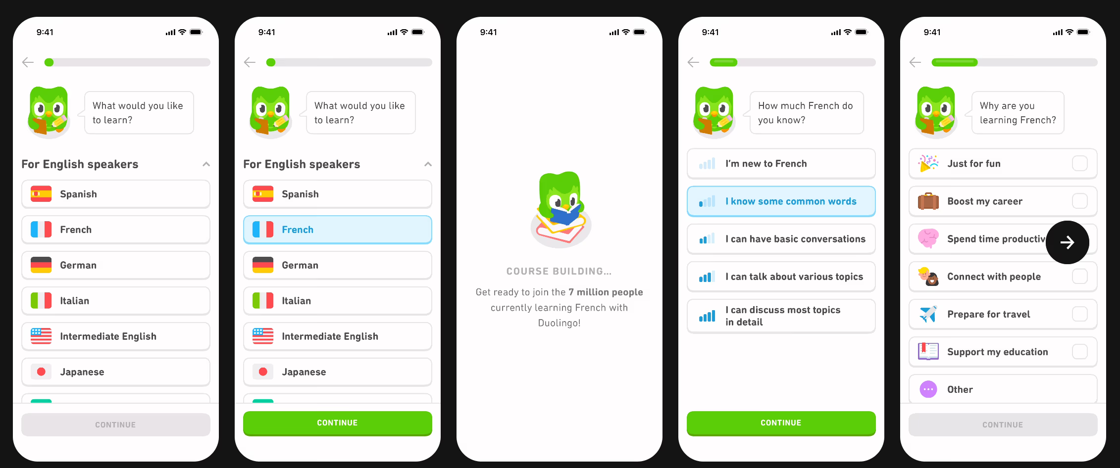
The aha moment of Duolingo is not choosing a language. It is completing the first lesson, real, interactive, playful, even before creating an account. The user speaks Spanish (a little) after 3 minutes. The paywall comes after. The sequence is almost perfect.
Noom
Noom uses a long quiz (more than 30 questions) to personalize its onboarding. The aha moment is not a feature: it is the personalized results page, with a projected weight curve, a target date, a plan "made for you". The user has not paid anything yet, but they already feel they have a coach. The paywall that follows converts because the user wants access to that plan, not to a generic app.
Mojo (video creation app)
According to data shared publicly by RevenueCat, Mojo's onboarding generates more than 50% of trial starts. Their aha moment: creating and previewing an animated story in under 60 seconds. You export before you pay.
These three apps have in common that they make you live the value before they make you pay for it.
You can read our case study on Sticker Editor to see how we work.
FAQ
What exactly is the aha moment in a mobile app?
A mobile app's aha moment is the instant when a new user experiences the product's real value for the first time. It is not an explanation or a promise, it is a concrete experience. It marks the shift from "I am testing" to "I understand". It is the moment from which the probability of retention and conversion increases significantly. Every app has its own, and it is rarely where the founder believes it is.
Should you place the aha moment before or after the paywall?
In the great majority of cases, the aha moment should precede the paywall. Asking a user to pay before they have felt your app's value means selling an experience they have not lived yet. The optimal sequence is: personalization → aha moment → paywall. That said, apps with strong user intent (B2B tools, very niche apps) can place a hard paywall earlier and get good results, because the user knows exactly what they came for.
Can you have several aha moments in an onboarding?
People generally talk about a single main aha moment, the one that triggers lasting engagement. But nothing stops you from building an onboarding that stacks micro-wins before reaching that peak. Those micro-wins (completing a step, seeing a first result, receiving positive feedback) maintain engagement and prepare the user to fully feel the central aha moment. What matters is that the path is built toward that moment, not that it is a collection of features poured out with no logic.
Does the aha moment change depending on the app category?
Yes, and significantly. Health and fitness apps often play on a projected personalized result (weight curve, tailor-made plan). Productivity apps play on the speed of executing a recurring task. Content apps play on the first piece of content consumed that resonates with the user's interests. What does not change: the aha moment is always an experience, never a description.
Also read
Mobile app onboarding: how to reach 20% conversion
77% of users abandon an app within the first 72 hours. Onboarding that converts shows the value before the email, the permissions, and the paywall.

Mobile app onboarding: Duolingo, Calm, and Headspace, decoded
60% of a mobile app's conversions happen in the first week, and 55% of cancellations of a 3-day trial happen on Day 0. Duolingo anchors motivation, Calm makes you feel the product, Headspace personalizes the path.
How do you know whether your onboarding actually leads to the aha moment?
If you have analytics, measure your onboarding completion rate screen by screen and identify where the drop-offs are largest. A massive drop-off before a given screen often signals that users abandon before reaching the value. If you do not have data yet, run unmoderated user tests, and watch users go through your onboarding without helping them. The moment they light up and engage will give you a strong signal on where your aha moment sits.