Sticker Editor: onboarding, double paywall, and ASO
On Sticker Editor, the winning screenshot variant produced +20% downloads, after four to five tests. Onboarding has you create a sticker before the paywall, then a second screen offers a 6-month plan.

Article summary
- Users were already downloading Sticker Editor. The problem was conversion: firstapp worked on the onboarding, the paywall, and the screenshots.
- The new onboarding opens the tools, has you create a first sticker, then shows the paywall. Value comes before the ask to pay.
- The review ask sits right after the first successful creation, when the user has just got a result they are proud of.
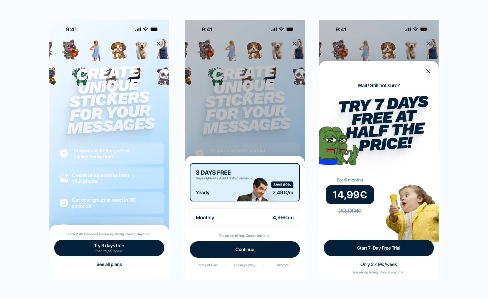
- Closing the first paywall opens a second screen: a 6-month plan at half the annual price, the same total cost as a year.
- Four to five screenshot variants were tested in App Store Connect. The winner produced +20% downloads, at constant traffic.
Summarize this article with
There are two kinds of app founders. Those who wait to see if it works. And those who test, iterate, challenge, push, and treat their app as a business to run, not a product to hope for.
Charles is in the second category. With his brother, he builds apps in series. Projects that are thought through, built, launched, optimized. Sticker Editor was one of them, a sticker creation and editing app with a real user base, downloads coming in, but conversion that was not keeping up.
That is when he contacted us. And what happened next is worth telling in detail.
Charles, a serial app maker
Charles is not a founder discovering the world of apps. He has several to his name, with his brother. That serial-maker model has a direct consequence on how you work: he does not arrive with certainties, he arrives with hypotheses. He knows that what works on one app does not necessarily work on another. He knows that the data is right and intuition is wrong.
Sticker Editor had an audience. The problem was not acquisition: users were downloading the app. The problem was conversion and retention. Too many users came in, did not pay, and left. The value was there. The path to it, and the moment to monetize, were not.
firstapp worked on three axes at once: the onboarding, the paywall, and the App Store screenshots. If you want to estimate what this kind of work represents, our mobile app quote gives you a range in 7 steps.
Newsletter
Once a week.
Last issue
We opened 10 apps to see how they sell a subscription.
+534 people read us each week
The diagnosis: an app with potential that was not converting
Before touching anything, we mapped the existing user path. Where do they enter? Where do they drop off? What percentage reaches the paywall? What percentage gets past it? These are the essential metrics to track before any optimization.
The finding was clear on two points.
The first: the user was pushed toward the paywall before experiencing the app's value. They did not yet know what Sticker Editor could do for them. We were asking them to pay in order to discover it. That is an inverted order, and one of the most expensive in mobile conversion. It is exactly the kind of silent leak we detail in our analysis is your app losing money?
The second: the App Store screenshots did not clearly show what the app did. They were visually fine but they did not convert, meaning they did not trigger the download for someone who landed on them in search. That is a fundamental difference: a screenshot can be beautiful and bad at the same time.
Three workstreams. Onboarding, paywall, screenshots. We took them in that order.
Onboarding: let them try it before they pay
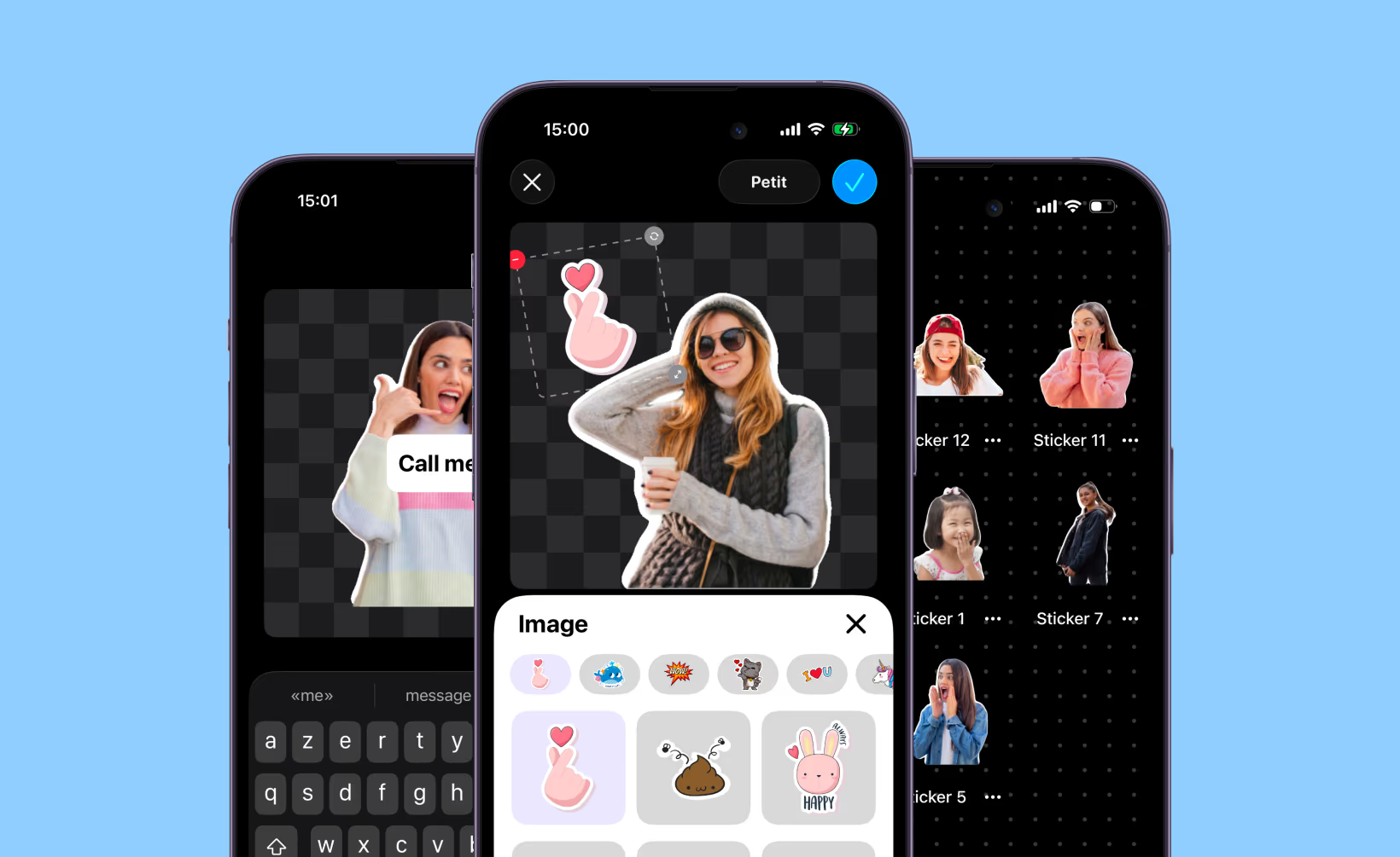
The central onboarding decision was to rebuild the flow entirely so the user could try the app before meeting the paywall.
Stated that way, the principle sounds obvious. It is still counterintuitive for many founders, because it delays the moment of monetization. The reasoning error is there: delaying the paywall does not reduce conversion, it raises the quality of the user who arrives at it.
A user who has created their first sticker, tried the app's tools, and felt what the product can do is in a radically different state of mind in front of the paywall. They are not discovering a promise. They are paying to continue something that has already started.
The new flow: enter the app → direct access to the core tools → first sticker created → paywall. Value before the ask. This principle is detailed in our mobile app onboarding guide.
The review strategy: the trigger we did not expect
Alongside the onboarding, we reworked the timing and the mechanics of the review ask. And the result was, in Charles's own words, incredible.
The logic is simple and often badly applied: asking for a review at the wrong moment is asking someone to rate an experience they have not had yet. The right moment to ask for a review is right after a moment of victory: a sticker that worked, a feature discovered, a result the user is proud of.
We placed the review ask immediately after the first successful creation. The user has just done something they like. They are in a positive emotional state. The probability that they leave a review, and a good review, is at its maximum.
The impact on review volume was immediate. And review volume has a direct effect on new users' trust and on ranking in App Store search results. We devoted a whole article to this mechanic: how to get your first 100 App Store reviews.
The double paywall: the 6-month mechanic
The paywall workstream was the richest in lessons. The final structure rests on two levels, a double paywall with a mechanic worth explaining in detail.
The first paywall: benefits and the best price put forward
The first paywall screen was fully reworked. No more list of technical features, benefits written from the user's point of view. What they can do, not what the app does. And a visual highlight of the annual plan as the "best value", with the price brought down to the month so the comparison is intuitive.
The second paywall: the second chance
This is the mechanic that really sets this approach apart. When the user closes the first paywall without paying, a second paywall opens. Not the same one: a different paywall, with a different offer.
That offer: a 6-month plan at half the annual price.
Mathematically, it comes to exactly the same thing for the user: 6 months at half price = the same total cost as the annual. Psychologically, it is a different offer. The user who refused the annual did not refuse for lack of interest. They may have refused because a 12-month commitment felt too long, or because they did not yet have enough trust. The 6-month plan answers that objection without sacrificing revenue.
It is a perfect example of what we detail in our analysis of the double paywall and conversion timing : the second chance does not dilute the first. It captures the users the first would have lost.
The screenshots: 4 variants, 1 winner, +20%
The ASO work did not stop at the screenshots. Before touching the visuals, we did a full audit of the App Store listing metadata, and there was work to do.
Cleaning up the keywords
First finding: keywords repeated across the title, the subtitle, and the keywords field. A very common mistake. The App Store indexes these three fields separately. Repeating the same word in all three does not rank it higher. It simply wastes precious characters that could have covered other queries. We redistributed the keywords to maximize the number of unique indexed terms.
The description: talk to the user, not to the machine
A second point that is often misunderstood: Apple does not index the app description. It has no impact on ranking in the App Store. Its only role is to convince the user who is already on the listing to download.
And in the description, the first 3 lines, the ones that show before the "More" button, are the only ones most users read. On Sticker Editor, those lines were written like SEO content: stuffed with keywords, no clear promise, no direct address to the user. We rewrote them to answer a single question: why should I download this app now?
Less jargon, more benefits. Fewer features listed, more value stated. These 3 lines are a sales space. They deserve to be treated as one.
The screenshots: 4 variants, 1 winner
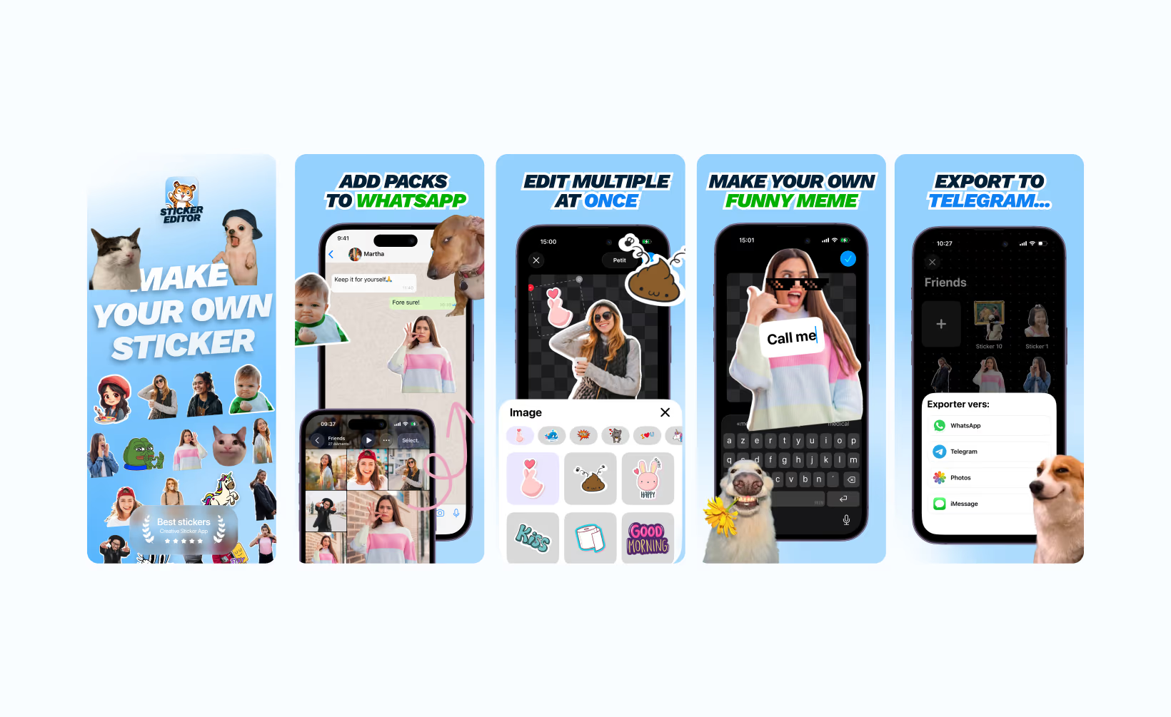
The starting hypothesis was that the existing screenshots did not clearly communicate the app's value to someone who did not know it yet. They showed the interface. They did not show what the user could accomplish with it.
We produced several sets of screenshots with different angles: the final result put forward, specific use cases, a before/after comparison, lifestyle in context. Each set was tested through App Store Connect A/B testing, Apple's native tool for testing App Store page variants on a portion of traffic.
Four to five variants were tested before finding the right one. Not because the first ones were bad, but because ASO A/B testing is iteration work, not divination. The winning variant produced +20% downloads versus the initial version.
That figure is significant because it is direct. Not a paywall conversion improvement, not a retention improvement: an improvement in raw downloads, at constant traffic. 20% more downloads without spending a single extra euro on ads. To understand what that represents in potential revenue, our analysis of how much a mobile app makes puts these figures in perspective. Our guide to optimizing the App Store listing details the principles that guided this work, and our guide to the 6 optimization levers covers the whole conversion chain.
What we take from it: the proactive founder as a key factor
Sticker Editor's results are not explained only by the optimizations we made. They are also explained by the way Charles worked throughout the project.
He did not let us do everything. He tested himself. He sent observations back, challenged hypotheses, proposed angles. When a test was launched, he followed the data closely and came back with precise questions. That level of engagement from a founder changes everything, not because it mechanically speeds up the work, but because it guarantees that decisions are made with the best possible knowledge of the product and the market.
It is something we see consistently among founders whose projects work: they do not delegate their understanding. They delegate the execution of certain tasks, but they stay owners of the decisions and active in the learning process.
Charles's energy and passion were not pleasant qualities to be around. They were performance factors, directly measurable in the results.
Questions on the Sticker Editor case
How long does it take to see results on an App Store screenshot A/B test?
An App Store Connect test needs enough traffic volume to be statistically significant. In practice, it generally takes 2 to 4 weeks to have usable data on an app with decent organic traffic. On low-volume apps, the test can take longer, or the results can stay inconclusive, which is also information. On Sticker Editor, the 4 to 5 variants tested represented several weeks of successive tests before identifying the winning variant.
Isn't a double paywall perceived as aggressive by users?
A badly designed double paywall can indeed create a bad experience, if it repeats exactly the same offer or if it shows up intrusively. What makes Sticker Editor's double paywall work is that it offers a genuinely different offer (the 6-month plan vs the annual) to a user who has signaled, by their behavior (closing the first paywall), a precise objection. It is an answer to an objection, not an aggressive follow-up.
Does the post-victory review strategy work in every app category?
The principle works everywhere. The mechanic is universal. What changes is the definition of the "moment of victory" by category. In a creation app like Sticker Editor, it is the first successful sticker. In a fitness app, it is the first completed session. In a productivity app, it is the first archived task. The moment of victory is always the first instant the user accomplished something thanks to the app. That is where the review ask converts best.
Should you test screenshots before or after optimizing the onboarding and the paywall?
The two axes work on different metrics. Screenshots affect the App Store page conversion rate, meaning the number of people who download after seeing the listing. Onboarding and the paywall affect what happens after the download. Ideally, you work on both in parallel, but if resources are limited, starting with the onboarding and the paywall is often more profitable: improving post-download conversion generates value on all existing traffic, not only on the incremental traffic.
Also read
Mobile app onboarding: how to reach 20% conversion
77% of users abandon an app within the first 72 hours. Onboarding that converts shows the value before the email, the permissions, and the paywall.
How to optimize a mobile app paywall: architectures, copy, and tests
82% of trial starts happen on the day of installation. The paywall is shown after the aha moment, a second screen recovers refusals, and six architectures plus a 14-day test plan structure the system.
How do you know if your onboarding pushes users to the paywall too early?
The clearest signal is the paywall conversion rate of users who completed the onboarding versus those who did not. If the difference is small, your onboarding is not preparing the user enough for the purchase decision. The other signal is the drop-off rate during the onboarding itself: if users drop off before the paywall, the path is too long or does not deliver enough value along the way.