How to keep your users on a mobile app
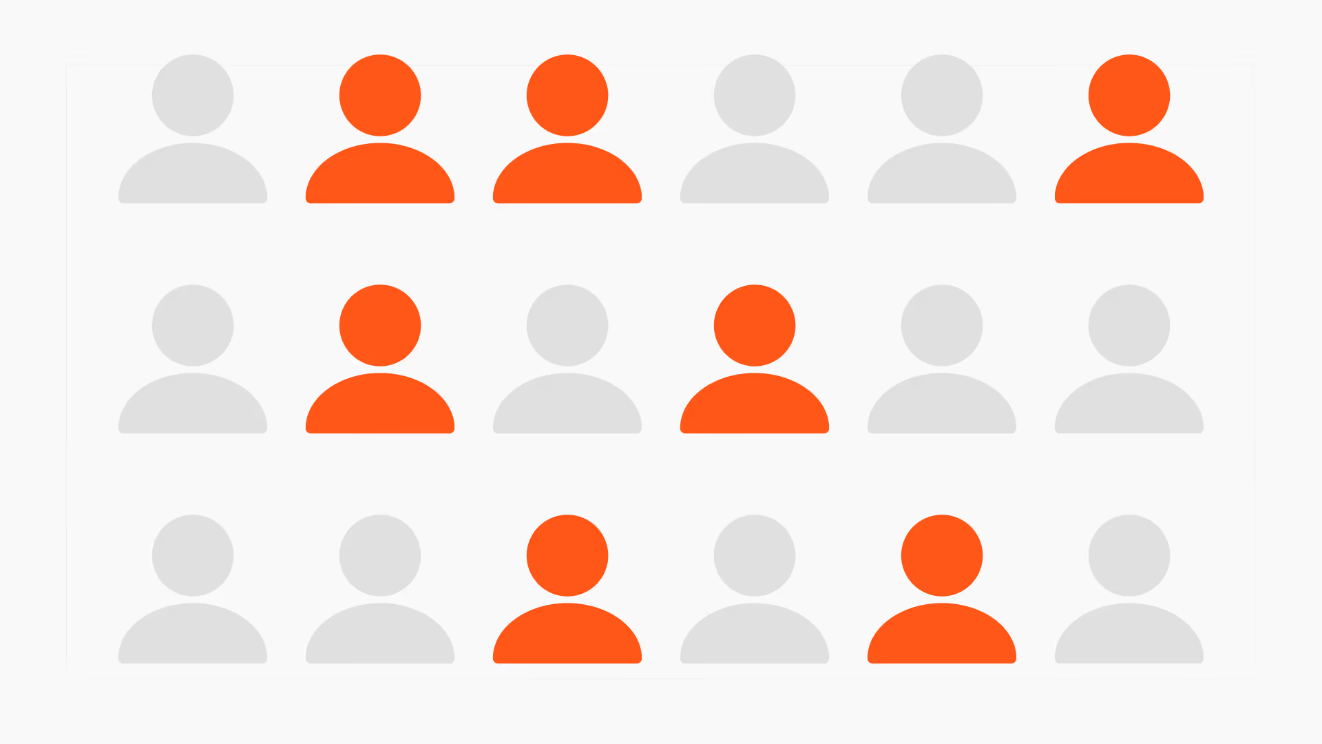
25% of mobile apps are opened only once. The first session, those first 3 minutes, decides whether the user comes back at J+1.

Article summary
- The first session, those first 3 minutes, decides the return at J+1, then D7, D30, and MRR.
- Apps whose D1 is under 20% rarely recover the ground at D7 or D30.
- The best apps aim for an aha moment in under 90 seconds.
- Duolingo has you learn 5 words before the account, Calm starts a 2-minute meditation from the first launch.
- The D1 median sits around 25%: below that, the first session has a problem.
Summarize this article with
The first session, these first 3 minutes after the first launch, is the most decisive moment in a user's lifecycle. D1 (the return rate at J+1) depends almost entirely on what happens in this window. And D1 conditions D7, which conditions D30, which conditions your MRR.
Everything is decided there. Most apps do not know it yet. And firstapp explains it all!
Why the first session is irreversible
An app's memory forms in a few minutes. The user who opens your app for the first time does not have an opinion yet. They build one in real time, from every friction, every moment of clarity, every instant when the value becomes tangible.
This process is fast and largely unconscious. In under 3 minutes, the user has already answered three questions without formulating them explicitly: do I understand what this app does? Have I already felt value? Do I want to come back?
If the answers are no, no, no, they will not come back. Not because they made a rational decision. Because the app slid into the mental category "not for me" before you had a chance to make your case.
The retention benchmarks confirm it: apps with a D1 under 20% rarely recover the ground at D7 or D30. Founders who notice that their retention is bad at J30 have often lost the battle at J1.
Newsletter
Once a week.
Last issue
We opened 10 apps to see how they sell a subscription.
+534 people read us each week
The 5 key moments of the first session
The first session is not a homogeneous block. It splits into 5 distinct moments, each with its own conversion mechanic and its own drop-off risks.
Moment 1 - The first screen (0 to 10 seconds)
The user sees your app for the first time. Not your onboarding, your first screen. The value proposition must be readable in under 5 seconds, without effort. If the user has to think to understand what the app does, you have already lost their attention.
The first screen is not the place for details. It is the place for a single promise, clear and desirable.
Moment 2 - Onboarding (10 seconds to 2 minutes)
This is the most studied phase, and the most poorly designed. Onboarding has two contradictory missions: collect the information needed for personalization, and not exhaust the user's patience before they have seen value.
The guiding principle: every question asked must have a visible counterpart immediately. If you ask for the user's goal, the result shown must differ according to the answer. Otherwise, the question is friction without justification.
Moment 3 - The aha moment (variable, but as early as possible)
We come back to it in detail in the next section. It is the moment when the user feels the value for the first time. Not understands it intellectually. Feels it. It is the tipping point of the first session.
Moment 4 - The monetization decision (after the aha moment)
Paywall, trial, freemium: the moment when the question of money arrives. If this moment arrives before the aha moment, the conversion rate collapses. If it arrives after, the user is in the best possible state of mind to say yes. Timing is everything. Our paywall guide details the architectures that maximize this conversion.
Moment 5 - The end of the first session
The user closes the app. What do they take with them? A feeling of accomplishment, a promise left unkept, or nothing in particular? This moment determines whether they will come back. The best apps create an "open loop" at the end of the first session: an action started, a result still to come, a reason to come back tomorrow.
The aha moment: finding it and accelerating it
The aha moment is the most important concept in mobile product design, and one of the most poorly understood. It is not the moment when the user understands your app. It is the moment when they feel it.
Twitter's aha moment: follow 30 accounts. Spotify: listen to the first personalized playlist. Airbnb: find a unique place to stay in the city you are leaving for next month. These moments are not intellectual understanding. They are emotional experiences.
How do you identify your app's aha moment?
Start from the users who stayed. Not the ones who downloaded and disappeared. The ones still using the app 30 days after the first launch. Look for what they did in the first 10 minutes that the others did not do. That action, or that sequence of actions, is your aha moment.
If you do not have enough data yet, start from the core of your value. What is your app's central promise? What is the shortest moment in which a user can experience it concretely? That moment is the aha moment to accelerate.
How do you accelerate time-to-aha?
Remove everything that separates the user from that moment. Signup steps that are not necessary before the value. Onboarding questions whose answers change nothing in the experience. Intro screens that explain instead of showing.
On Calyra (ex-Nutria), the calorie-tracking app that we launched and that generated €30,000 in the first month, the aha moment is the scan of the first food. Nutritional breakdown in 2 seconds, displayed clearly. The whole onboarding is designed to get the user to that scan as fast as possible.
Time-to-value: the obsession you do not have yet
Time-to-value (TTV) is the time that passes between the first launch of the app and the moment the user feels value for the first time. It is a metric almost no mobile app measures, and it is one of the most predictive of D1.
A short TTV does not mean a short onboarding. It means an effective onboarding. The distinction matters: an onboarding of 12 questions can have a short TTV if each question visibly contributes to the personalization the user then receives. An onboarding of 3 questions can have a long TTV if they come before 4 explanation screens and the first real action.
How do you measure your TTV?
Install your own app as if you were an ordinary user. Time the gap between the first launch and the first moment you feel something. If that time exceeds 90 seconds, you have a problem. If it exceeds 3 minutes, you lose the majority of your users before they have seen your value.
The reference apps on this subject, Duolingo, Calm, and Headspace, all have a TTV under 60 seconds. Not by chance. By obsession with the detail on every screen of the first session.
The 6 mistakes that kill the first session
1. Asking for signup before value
The email, the password, the verification, all of that before the user has seen what your app does. This is the most common friction and the most expensive. Apple Sign In and Google Sign In reduce this friction to one tap, but even a tap that is too early is one tap too many. Ask for signup after the aha moment when that is possible.
2. Explaining instead of showing
Screens that say "Here is how our app works," with illustrations and text, are admissions of failure. If your value has to be explained rather than experienced, that is a design problem, not a communication problem. Every explanation screen is a wasted opportunity for value.
3. The paywall before the aha moment
The most documented mistake in mobile monetization. A user who has not yet felt value has no reason to pay. Placing the paywall before the aha moment is asking someone to pay for a restaurant before seeing the menu. The paywall timing is one of the decisions with the most impact on the conversion rate.
4. Too many features visible at once
The user opens the app and sees 8 tabs, 12 buttons, 3 notifications. They do not know where to start. Progressive disclosure, showing features as the user needs them, is a fundamental principle that overloaded apps systematically ignore.
5. The push permission too early
Asking for notification permission in the first 30 seconds is the most common timing mistake. The user still has no reason to want your notifications. The refusal is almost automatic. And on iOS, that refusal is final. The iOS permission prompts deserve as much care as your onboarding.
6. Ending the session in a void
The user has completed onboarding. They have seen value. And then... nothing. The app displays in its default state, with no indication of what they should do next. The first session must end on an "open loop": a suggested next action, a goal ahead, a concrete reason to come back tomorrow.
These mistakes are not details. They are the direct causes of a bad D1. Our analysis of app-building mistakes covers them in a broader context.
What Duolingo, Calm, and Headspace do differently
The three reference apps for retention in the lifestyle category have one thing in common: they all sacrificed features in V1 to accelerate time-to-value.
Duolingo starts the first lesson before signup. You learn 5 words before creating an account. The aha moment, "I just learned something in 2 minutes," arrives before any administrative friction. Signup comes after, naturally, to "save your progress."
Calm has you listen to a 2-minute guided meditation from the first launch. No explanation, no signup, just the experience. Value is felt before it is explained.
Headspace uses a short animation and a first guided breathing exercise to create a first moment of calm in under 60 seconds. The aha moment is physiological, not intellectual.
In all three cases, the structure is identical: immediate value → signup to keep it → onboarding to personalize → paywall. In that precise order. A full analysis of their onboardings is available in our breakdown of these three apps: Duolingo, Calm, Headspace decoded.
How firstapp designs the first session
At firstapp, the first session is the first subject we take up on every project. Before the features, before the screens, before the stack choice. Because everything else depends on this moment.
Our process comes down to 4 steps.
Identify the aha moment upstream. We start from the product's central promise and look for the shortest path between the first launch and the first experience of that promise. On every project, this work is done in a workshop with the founder, not from specs, from a simple question: "what is the moment when your user will say it was worth downloading?"
Map the first session screen by screen. Every screen in the first session has a defined mission: inform, personalize, or deliver value. We remove every screen that does not have a clear mission. The first session should not be long. It should be dense with value.
Sequence the frictions. Signup, permissions, payment: each friction is placed at the moment when the value delivered justifies asking for it. Not before. This sequencing is documented and tested before development, not after.
Measure D1 from launch. This optimization work is part of our post-launch support.
A well-designed D1 does not guarantee your app's success. But a bad D1 guarantees its failure, whatever the quality of the rest.
FAQ on the first session
How long does an ideal "first session" last?
There is no universal ideal duration. There is a goal: that the user has felt value before closing the app. In practice, the best apps aim for an aha moment in under 90 seconds. The total length of the first session depends on the product: 3 to 5 minutes for a content or fitness app, under 2 minutes for a utility app. What matters is not the duration but the density of perceived value.
Should you put the user through a long onboarding or a short one?
Neither. You should put the user through an onboarding that delivers value as fast as possible. Length is a consequence, not a steering variable. In fitness and health, long onboardings (10 to 15 steps) convert better because each question contributes to a personalization felt immediately. In utility apps, an onboarding of 3 steps can be too long if those 3 steps give the user nothing.
When should you place the paywall in the first session?
After the aha moment, never before. This is the most important rule in mobile monetization. The user who has already felt value is in a radically different state of mind in front of the paywall. They pay to continue something that has already started, not to trust a promise. On apps that respect this timing, the paywall conversion rate is structurally higher.
Should the first session be different on iOS and Android?
The experience should be consistent across the two platforms, but some details change. Permissions are asked for differently (iOS is stricter, one single attempt per permission). Navigation patterns have different conventions. And the average user profile varies. iOS users statistically have a higher conversion rate on paid subscriptions, which can justify a slightly more aggressive paywall.
Also read

Aha moment: how to find it in your onboarding?
More than 70% of users uninstall in the first 3 days, often without having felt the app's value. The aha moment is that click, and onboarding has to place it before the paywall.
Mobile app onboarding: Duolingo, Calm, and Headspace, decoded
60% of a mobile app's conversions happen in the first week, and 55% of cancellations of a 3-day trial happen on Day 0. Duolingo anchors motivation, Calm makes you feel the product, Headspace personalizes the path.
How do you measure whether your first session is effective?
D1 (the return rate at J+1) is the main indicator. The median sits around 25%. If you are below that, your first session has a problem. In addition, track the onboarding completion rate (step by step, to identify drop-offs), time-to-aha if you can define it as an event in your analytics, and the paywall conversion rate on sessions that completed onboarding versus those that did not.